JEDI's Area Chart
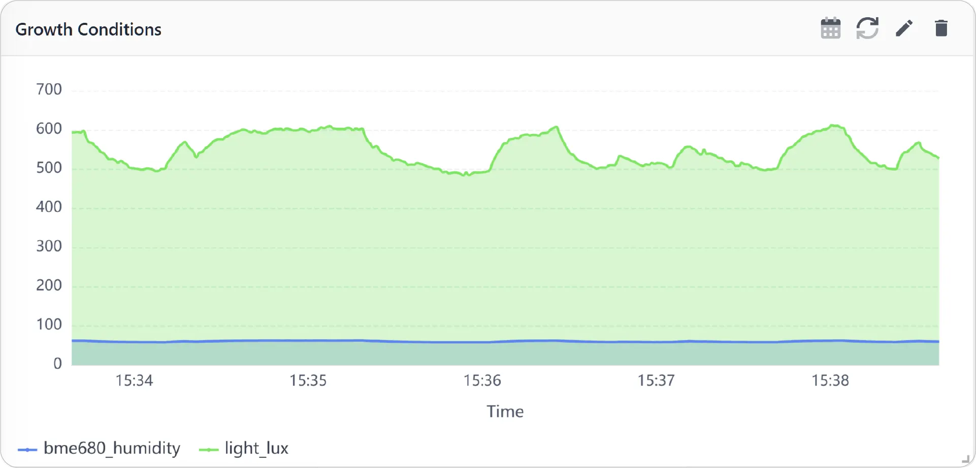
Area Chart is a multi-metric, time-based visualization that displays multiple metrics as filled areas under their respective lines. It helps emphasize cumulative trends over time, making it easier to compare how different metrics contribute to overall system behavior.
Key Features
-
Filled trend visualization
Uses shaded areas to highlight metric over time
-
Multi-metric comparison
Displays multiple data streams in a single chart for better context
-
Cumulative insight
Helps visualize contribution and overlap between metrics
-
Time-based analysis
Clearly shows how values evolve across time intervals
-
Supports real-time and historical data
Enables both live monitoring and past trend analysis
Configuration
Area Chart for Grid Dashboard
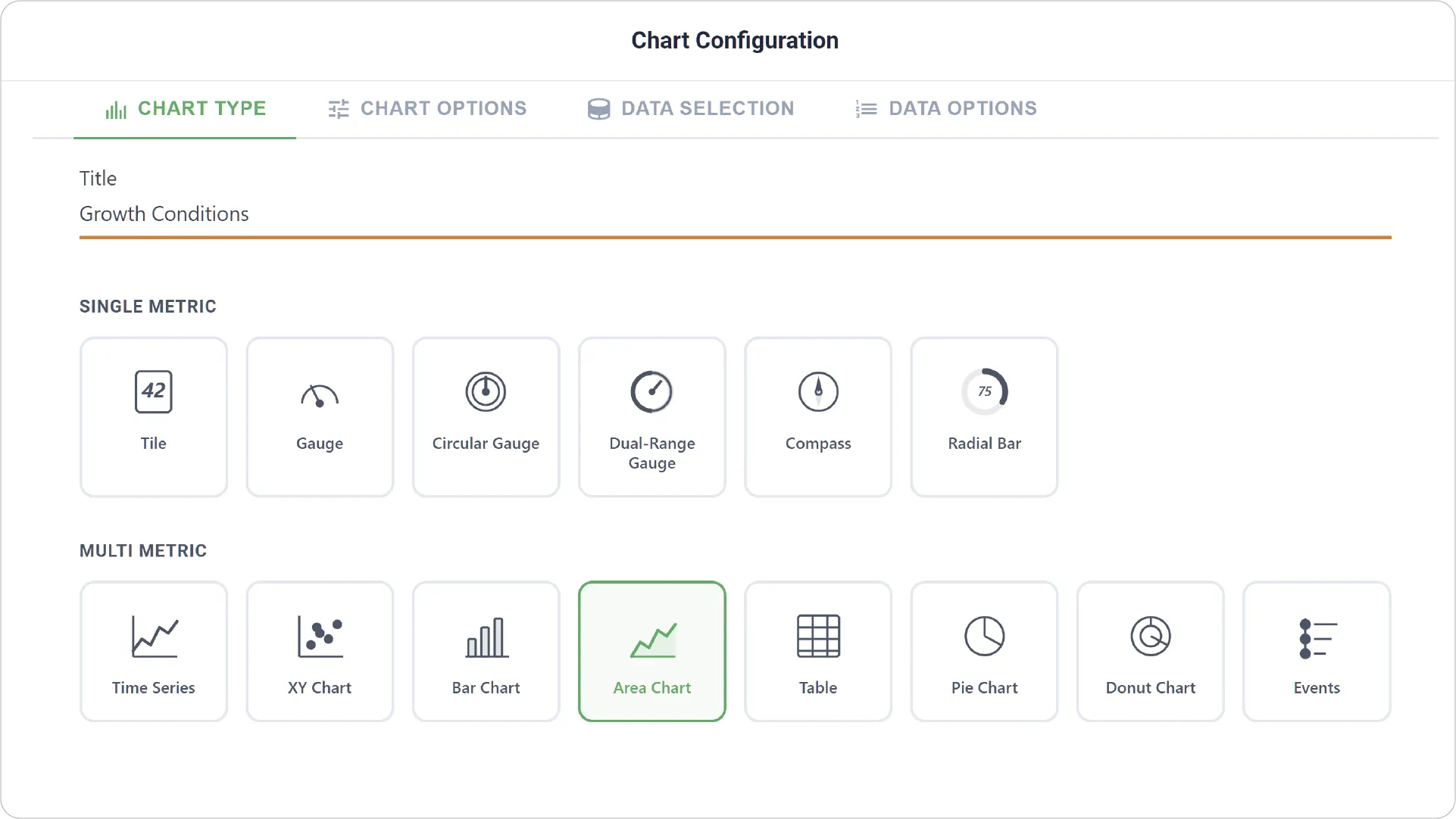
- Chart Type: Select the Area Chart type and define a clear title for the visualization.
-
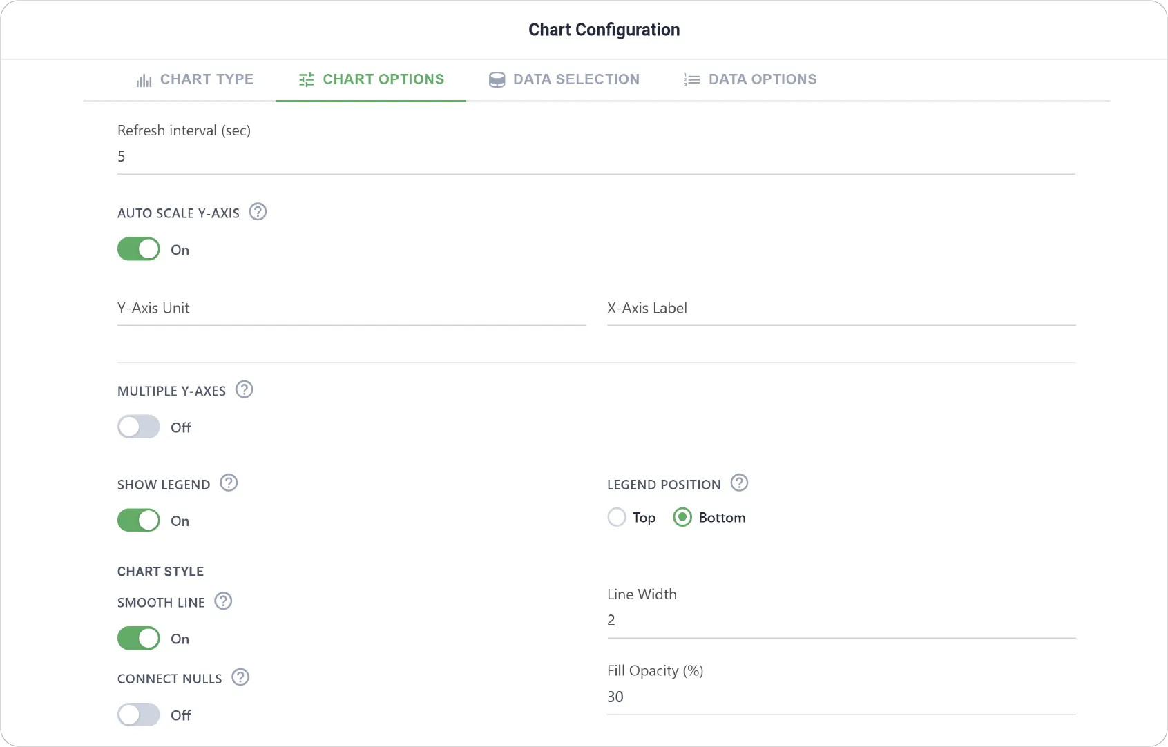
Advanced Chart Options: Configure visual behavior and appearance, including:
- Enable or disable auto-scaling of the Y-axis for dynamic range adjustment
- Set Y-axis units for consistent metric interpretation
- Configure X-axis label for time representation
- Support multiple Y-axes for metrics with different scales
- Customize legend settings (visibility, position, formatting)
- Adjust chart style options including smoothing, line width, connect null values, and area fill opacity
- Enable Link Dashboard to link this chart to another dashboard.
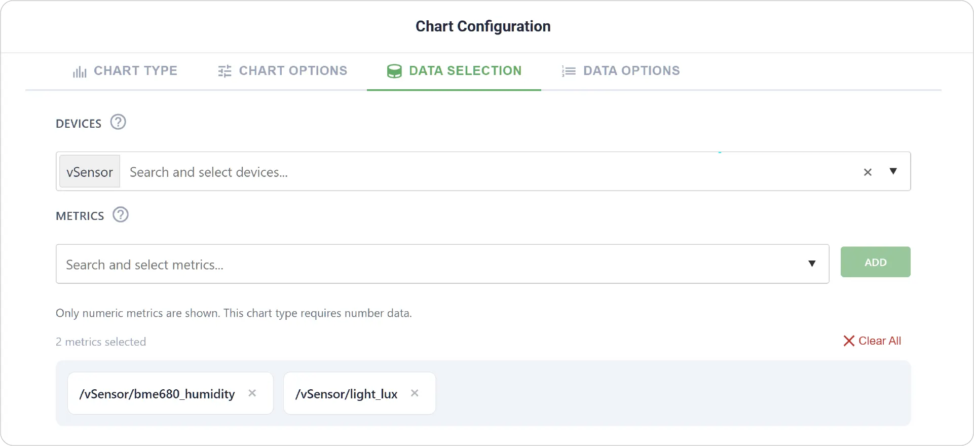
- Data Selection: Choose the device and select multiple metrics to plot on the same chart.
-
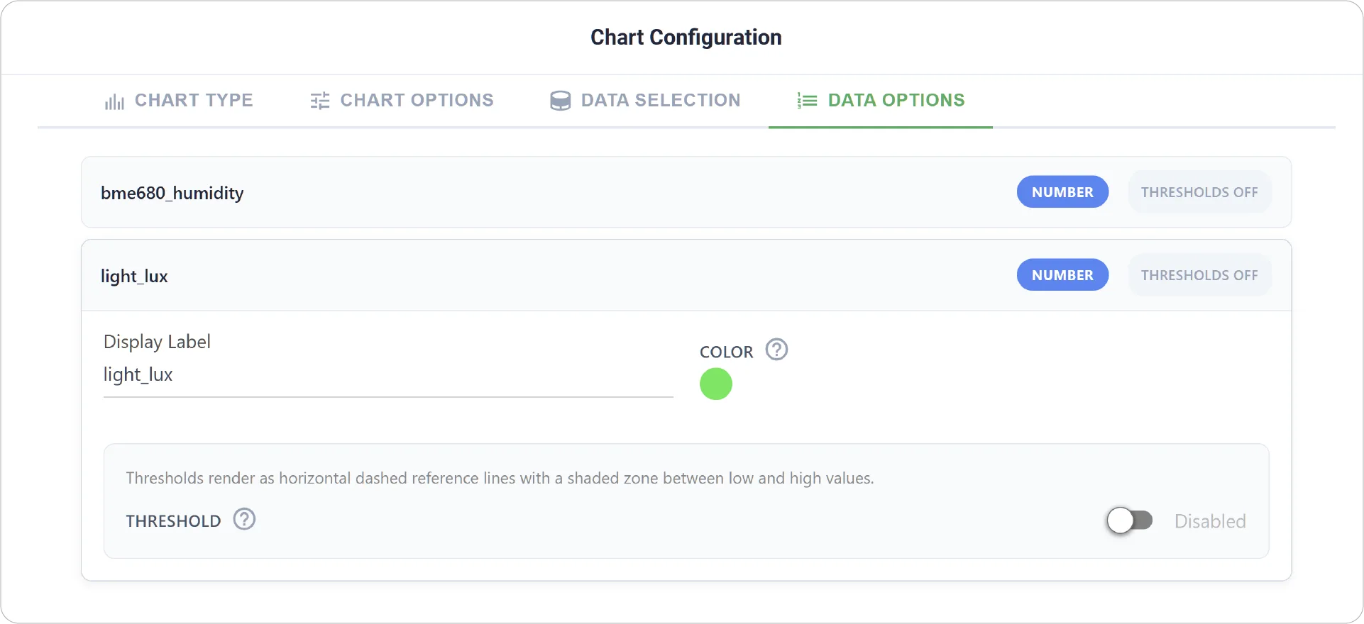
Advanced Data Options: Customize how each metric is displayed, including:
- Customize display labels for each metric
- Configure per-metric threshold rules
- Define low and high zones for individual metrics to highlight performance conditions
Real-World Examples
-
Network Traffic Monitoring:
Visualize upload and download traffic together to understand bandwidth usage patterns over time.
-
Energy Consumption Analysis:
Track multiple energy sources or loads to see how total consumption changes throughout the day.
-
Environmental Data Tracking:
Compare temperature, humidity, and air quality trends as overlapping contributions to environmental conditions.
Bring depth and clarity to your dashboards with the Area Chart. Explore more chart types to continue enhancing your dashboard experience.
Need help? Contact our support team: support@machinechat.io