Visualize Distribution Instantly with JEDI's Pie Chart
Pie Chart's circular visualization helps represent multiple metrics as slices of a whole, allowing you to easily compare their relative distributions. This chart is best suited for scenarios where you want to emphasize how individual values contribute to a total, without focusing on changes over time.
Key Features
-
Whole-To-Part Relationship
Clearly shows how individual metrics contribute to a complete dataset
-
Label-Driven Clarity
Supports clear labeling for better identification of each slice
-
Color-Coded Differentiation
Uses distinct colors to easily distinguish between metrics
-
Minimal Visual Complexity
Keeps the visualization clean and focused for quick insights
Configuration
Pie Chart for Grid Dashboard
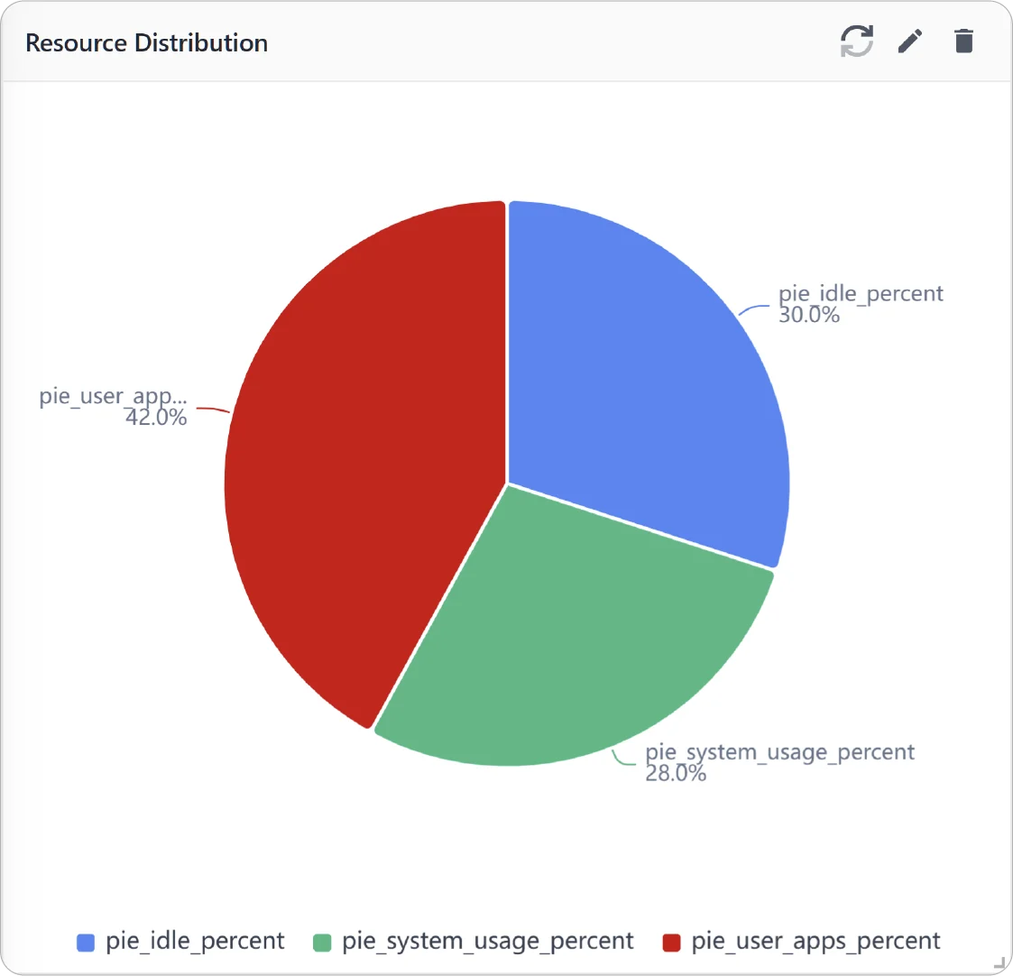
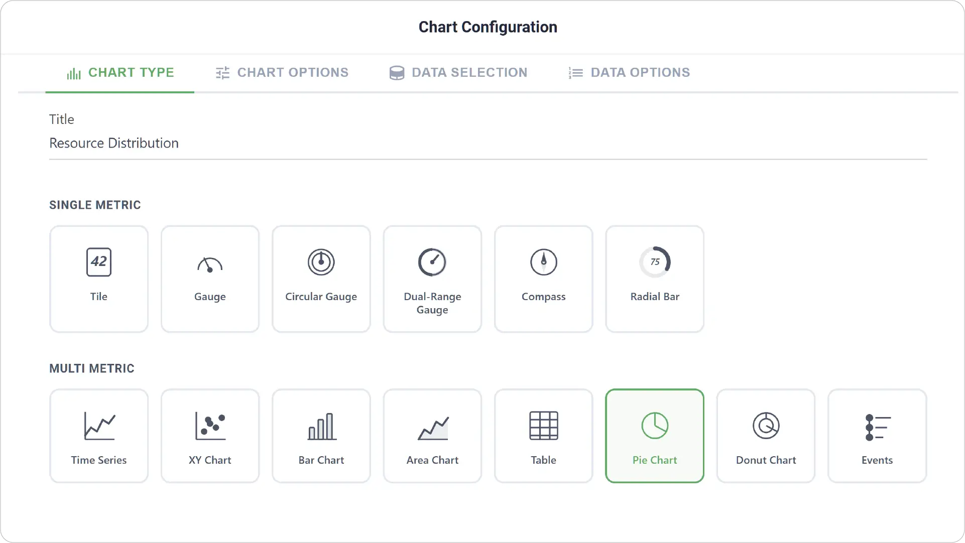
- Chart Type: Select the Pie Chart type and provide a title for your chart.
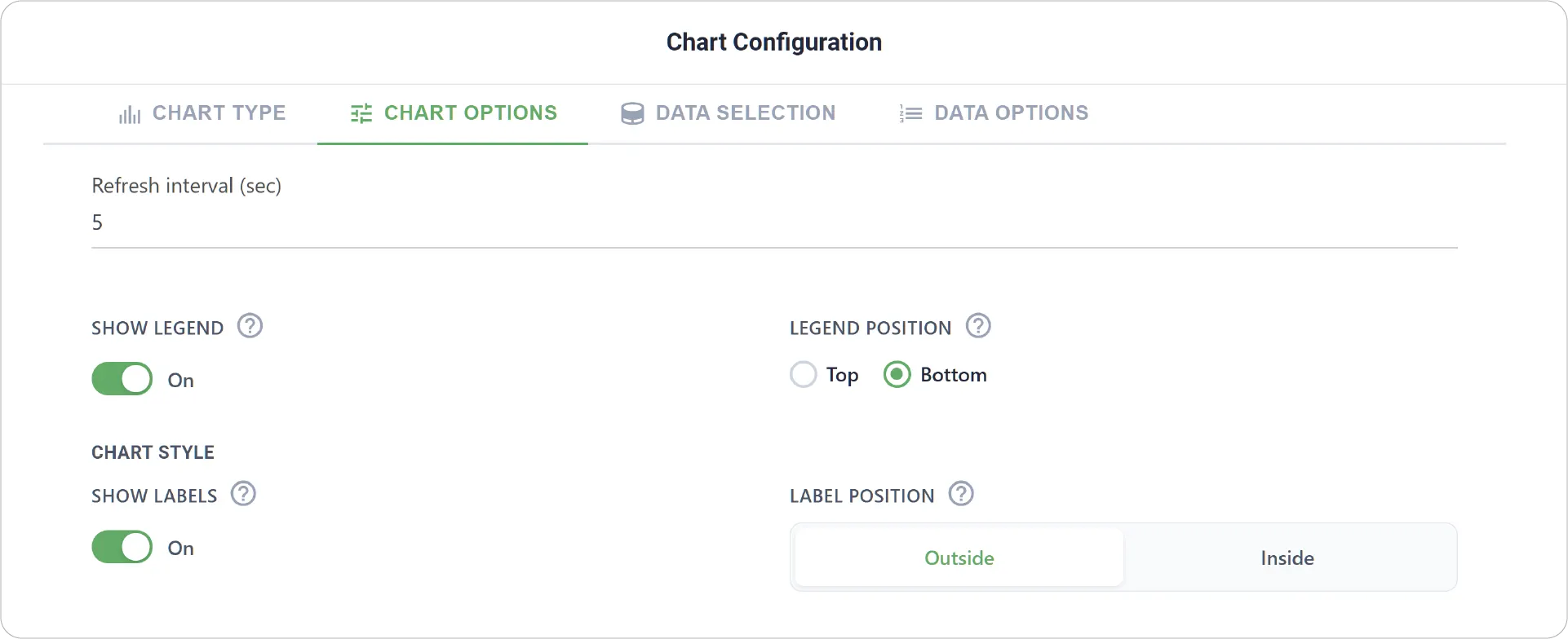
- Chart Options: Configure visual elements such as legend and labels.
- Enable Link Dashboard to link this chart to another dashboard.
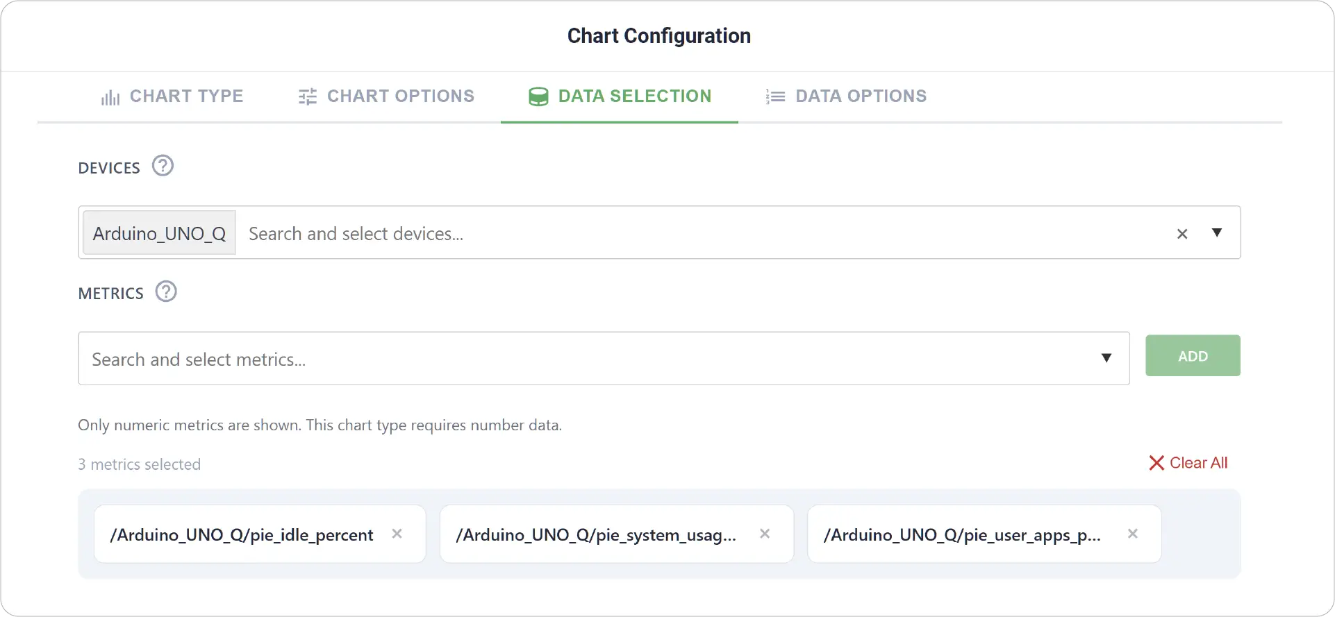
- Data Selection: Choose the device and select multiple metrics to represent as slices of the pie chart.
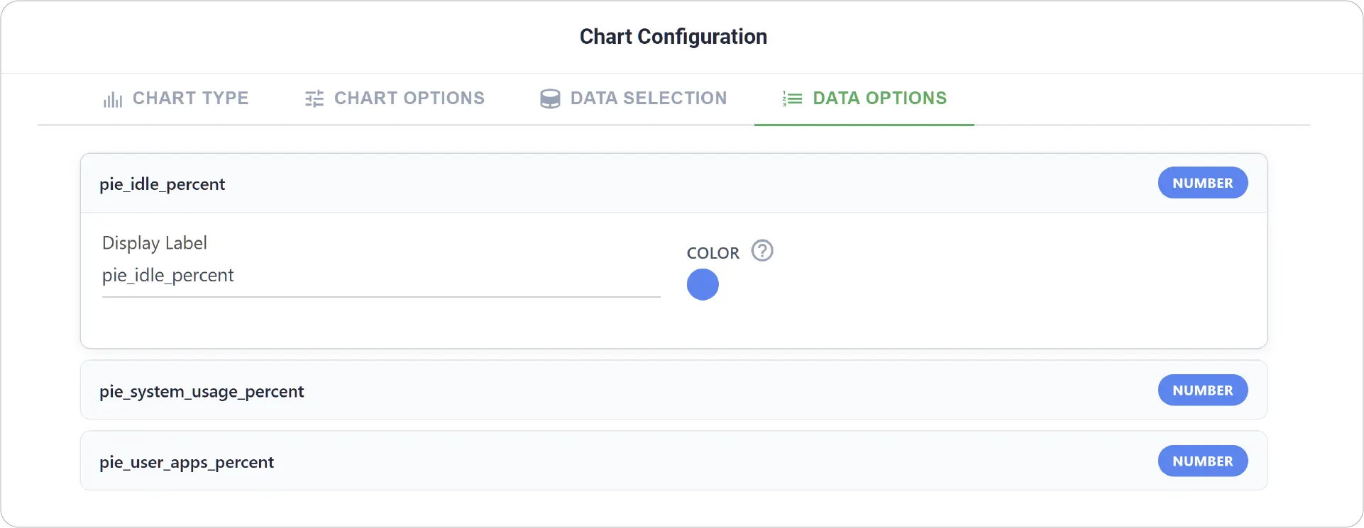
- Data Options: Customize each metric with display labels distinct colors.
Real-World Examples
-
Device Contribution Analysis
Compare how different devices contribute to a total metric, such as total output or total data generated.
-
Production Output Distribution
Compare output levels across multiple machines or production lines.
-
Network Traffic Sources
Display the share of traffic coming from different sources or endpoints.
Simplify data comparison with the Pie Chart's straightforward, proportion-based design. Explore other chart types to create richer and more informative dashboards.
Need help? Contact our support team: support@machinechat.io