Visualize Proportions at a Glance with JEDI's Donut Chart
Donut Chart is a circular visualization used to represent the proportion or distribution of multiple metrics within a whole. Each segment of the donut corresponds to a metric, making it easy to compare relative values at a glance.
This chart is ideal for highlighting how different metrics contribute to a total.
Key Features
-
Proportional Representation
The chart displays each metric as a segment of a whole, making relative comparisons intuitive
-
Compact and Clear Differentiation
Presents multiple data points in a space-efficient circular format using distinct colors
-
Customizable Labels and Legends
Enhances readability with flexible labeling and legend options
-
At-a-Glance Insights
Quickly understand how values are distributed without detailed analysis
Configuration
Donut Chart for Grid Dashboard
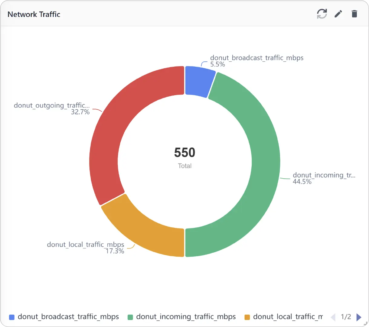
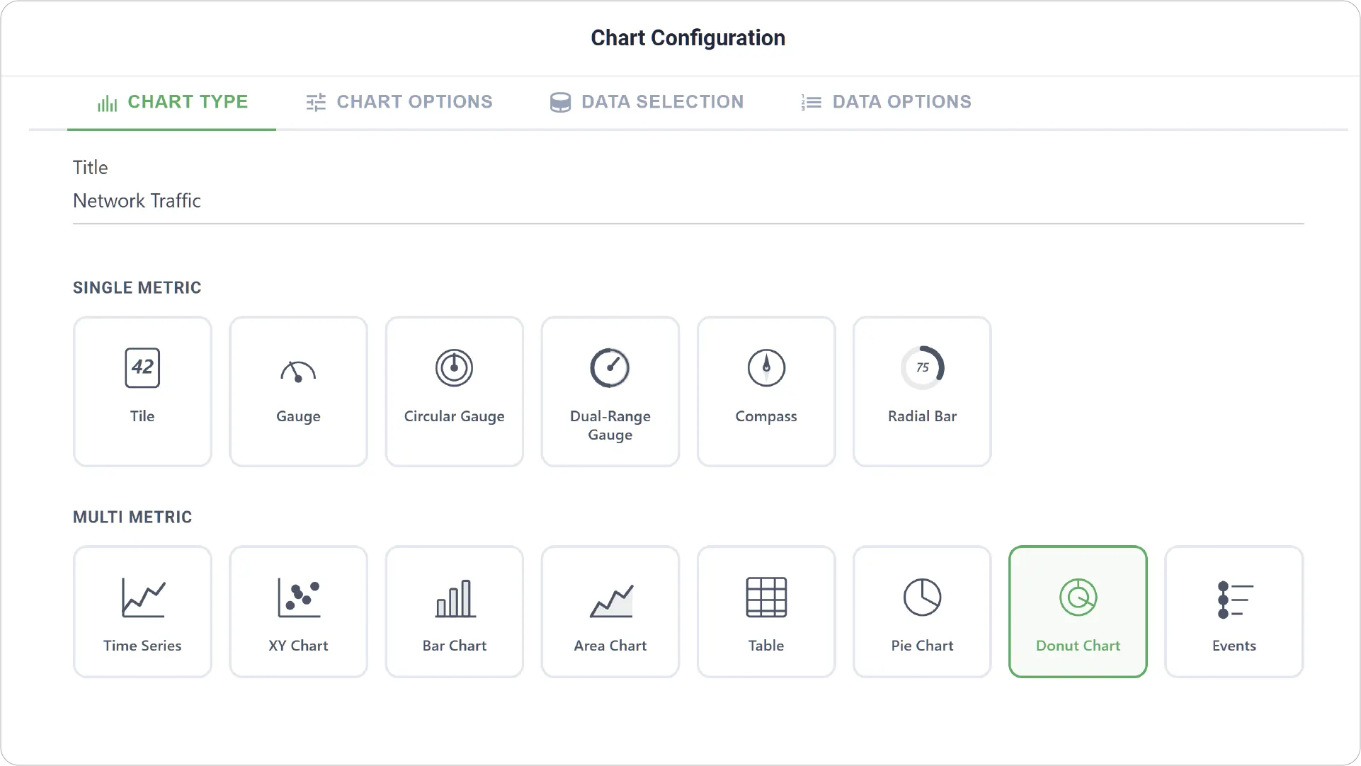
- Chart Type: Select the Donut Chart type and provide a title for your chart.
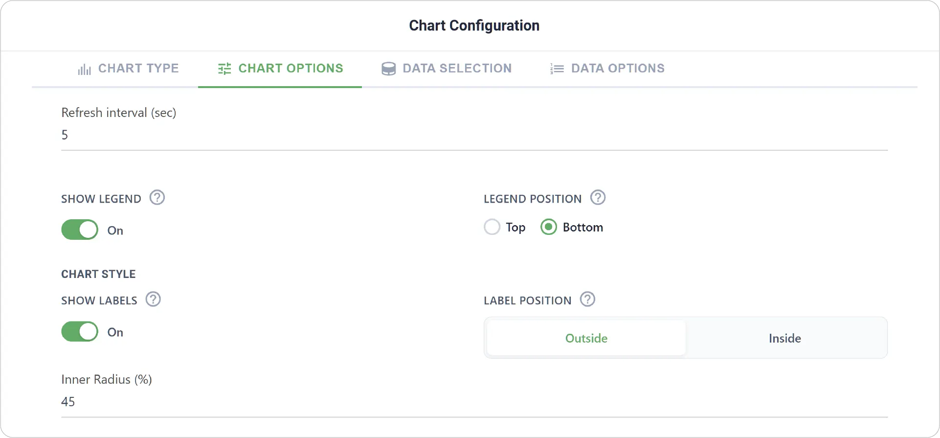
- Chart Options: Configure visibility and position settings for legend and labels.
- Enable Link Dashboard to link this chart to another dashboard.
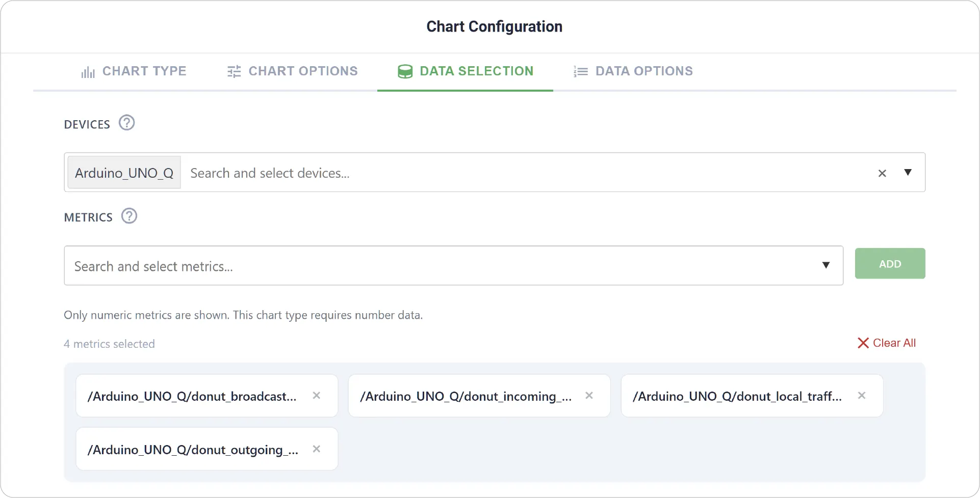
- Data Selection: Choose the device and select multiple metrics to represent as segments of the donut chart.
-
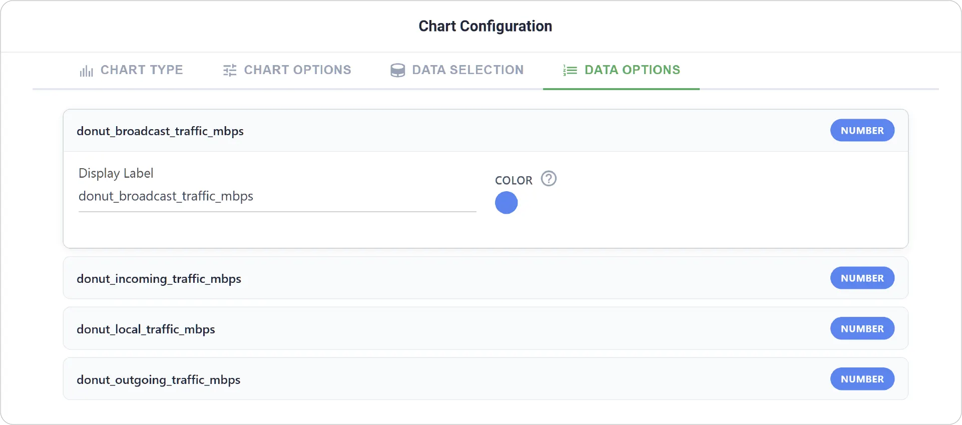
Data Options: Customize how each metric appears:
- Set display labels for each metric
- Assign colors to differentiate segments clearly
Real-World Examples
-
Resource Distribution Visualization
Show how resources such as CPU, memory, or storage are allocated across different processes.
-
Energy Usage Breakdown
Visualize how different systems or devices contribute to total energy consumption.
-
Category-Based Data Comparison
Compare values across categories such as device states or modes.
Bring clarity to your data distribution with the Donut Chart. Explore other chart types to build even more insightful and visually engaging dashboards.
Need help? Contact our support team: support@machinechat.io