JEDI's Gauge Chart: Visualize Metrics with Impact
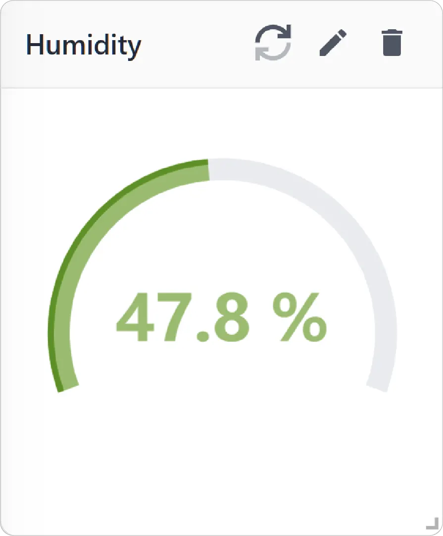
A Gauge Chart is a single-metric visualization used to display the current value of a metric within a defined range. It provides an intuitive, dial-style representation that makes it easy to understand the status of a metric at a glance.
Gauge charts are especially useful for monitoring key performance indicators (KPIs) and values that have clear minimum, maximum, and threshold boundaries.
Key Features
-
Single-metric focus
Designed to highlight one important metric at a time
-
Visual range representation
Displays values within a defined minimum and maximum range
-
Real-time updates
Reflects the latest value of the selected metric
-
Intuitive design
Easy-to-read gauge format for quick decision-making
Configuration
Gauge Chart for Grid Dashboard
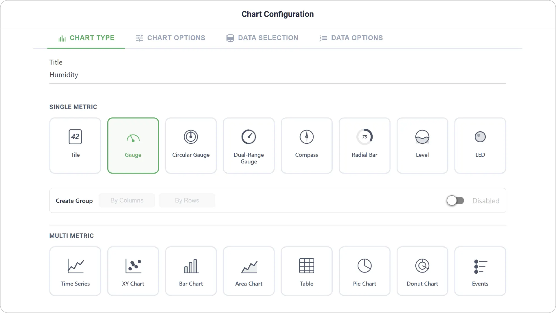
- Chart Type: Lets you select the chart type and provide a title.
- Enabling Create Group allows you to add more than one Gauge.
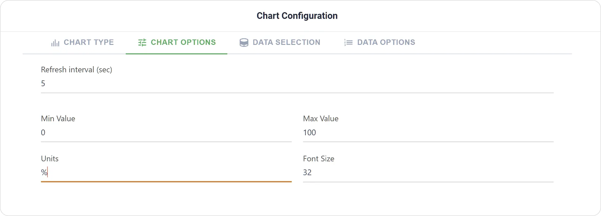
- Chart Options: Defining minimum/maximum values, font size, and units.
- Create Group Settings: Available when Create Group is enabled. Set Label Font Size for each grouped Compass Chart.
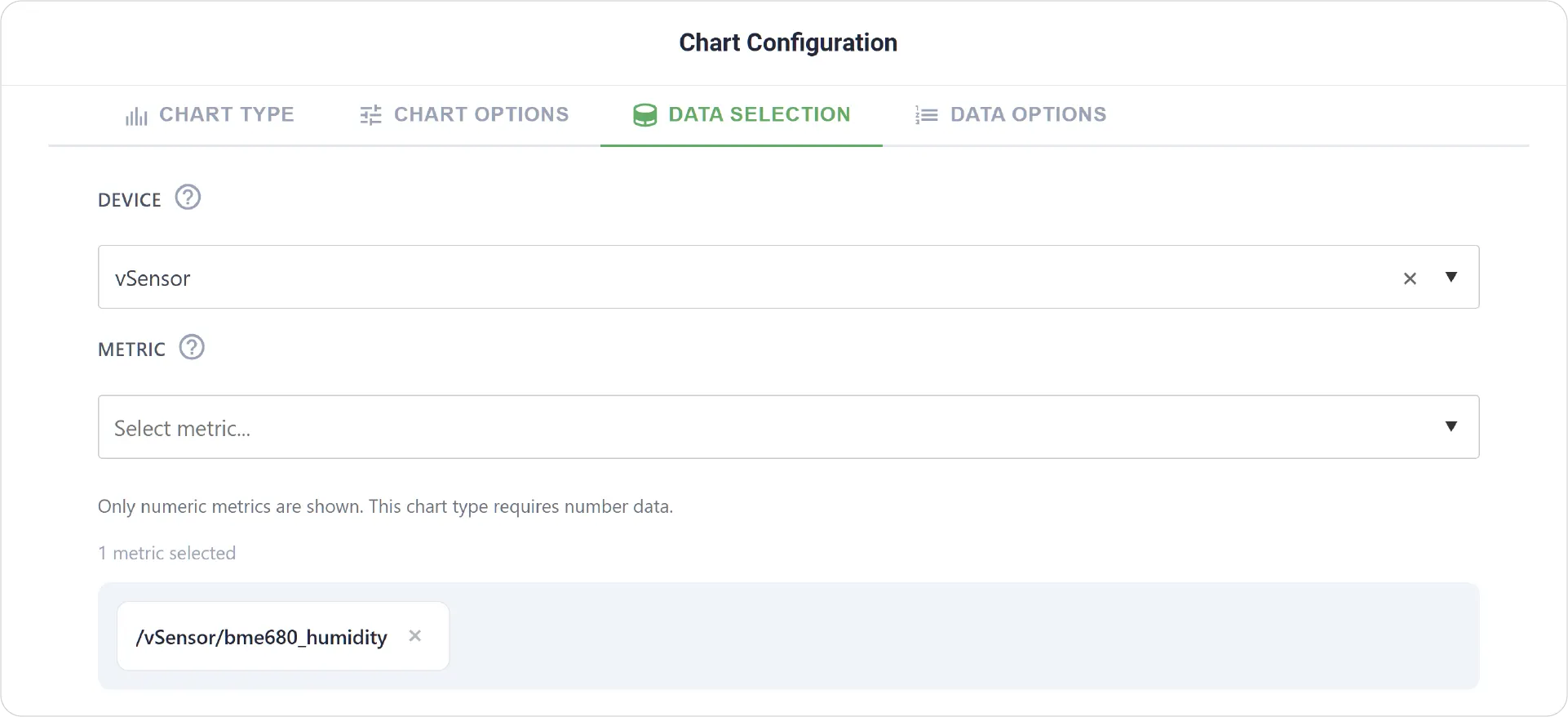
- Data Selection: Choose the device and select a single metric to display in the Gauge Chart.
- Add Item: Available when grouping is enabled, allowing addition of multiple Gauge Charts along with Min-Max Values, Units, Fill Color, and Threshold settings for each Metric.
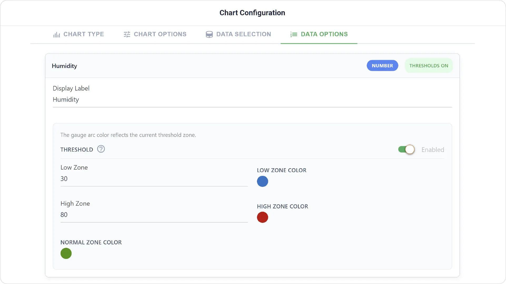
- Data Options: Customize how the data is presented, including display labels as well as configuring thresholds by setting color-coded ranges for different conditions.
- Data Options are not available when Create Group is enabled.
Real-World Examples
-
System Performance Monitoring
Track metrics like CPU usage, memory utilization, or battery level to quickly assess system health.
-
Environmental Threshold Tracking
Monitor values such as temperature or humidity and identify when they exceed safe operating ranges.
-
Industrial Equipment Status
Display pressure, speed, or load levels to ensure equipment is operating within acceptable limits.
Add a touch of visual clarity to your dashboards with the Gauge Chart! Explore our other Data Dashboard chart guides for more inspiration.
Need help? Contact our support team: support@machinechat.io