Explore Metric Relationships with JEDI's XY Chart
XY Chart provides a multi-metric visualization to plot relationships between two variables. Unlike time-based charts, the X-axis represents a selectable metric instead of time, while one or more Y-axis metrics are plotted against it.
This chart is ideal for analyzing correlations, patterns, and dependencies between different data points, helping you better understand how one variable influences another.
Key Features
-
Metric-To-Metric Comparison
Plots one metric against another instead of time
-
Correlation Visualization
Helps identify relationships and dependencies between variables
-
Flexible Axis Mapping
Enables custom selection of X and Y metrics for tailored analysis
-
Insight Into Data Distribution
Reveals clusters, trends, and outliers in the dataset
Configuration
XY Chart for Grid Dashboard
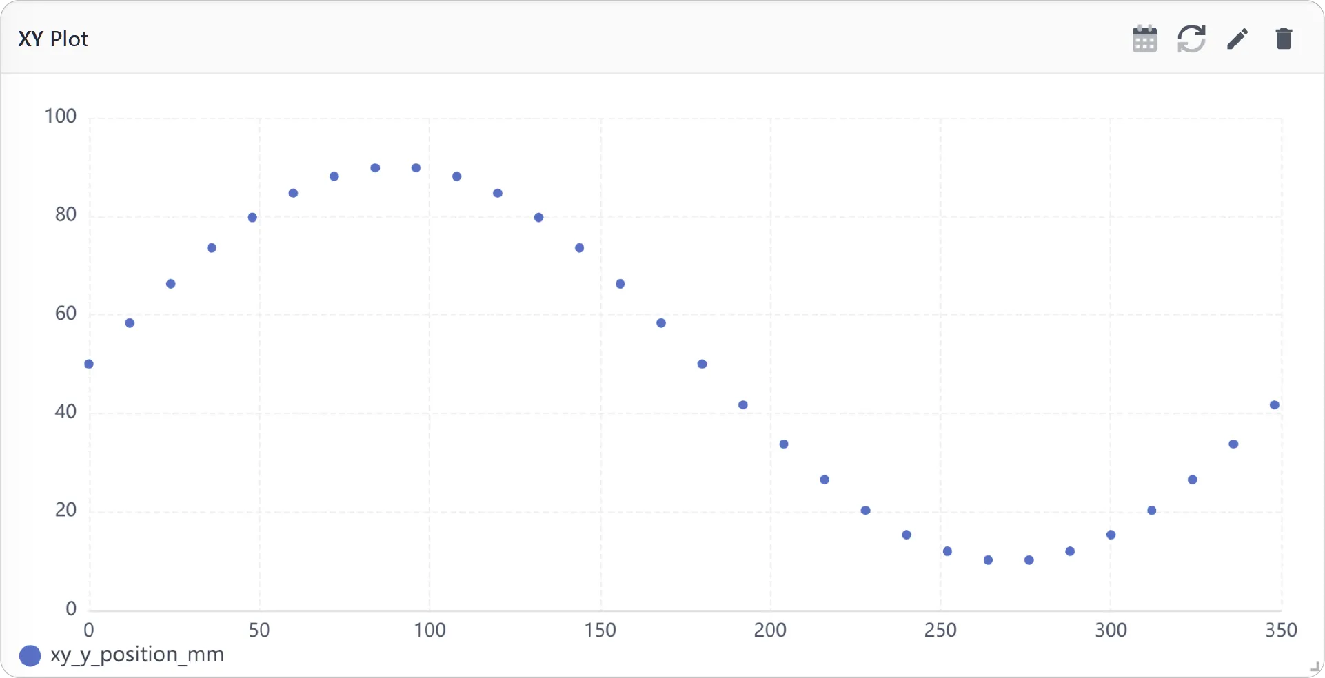
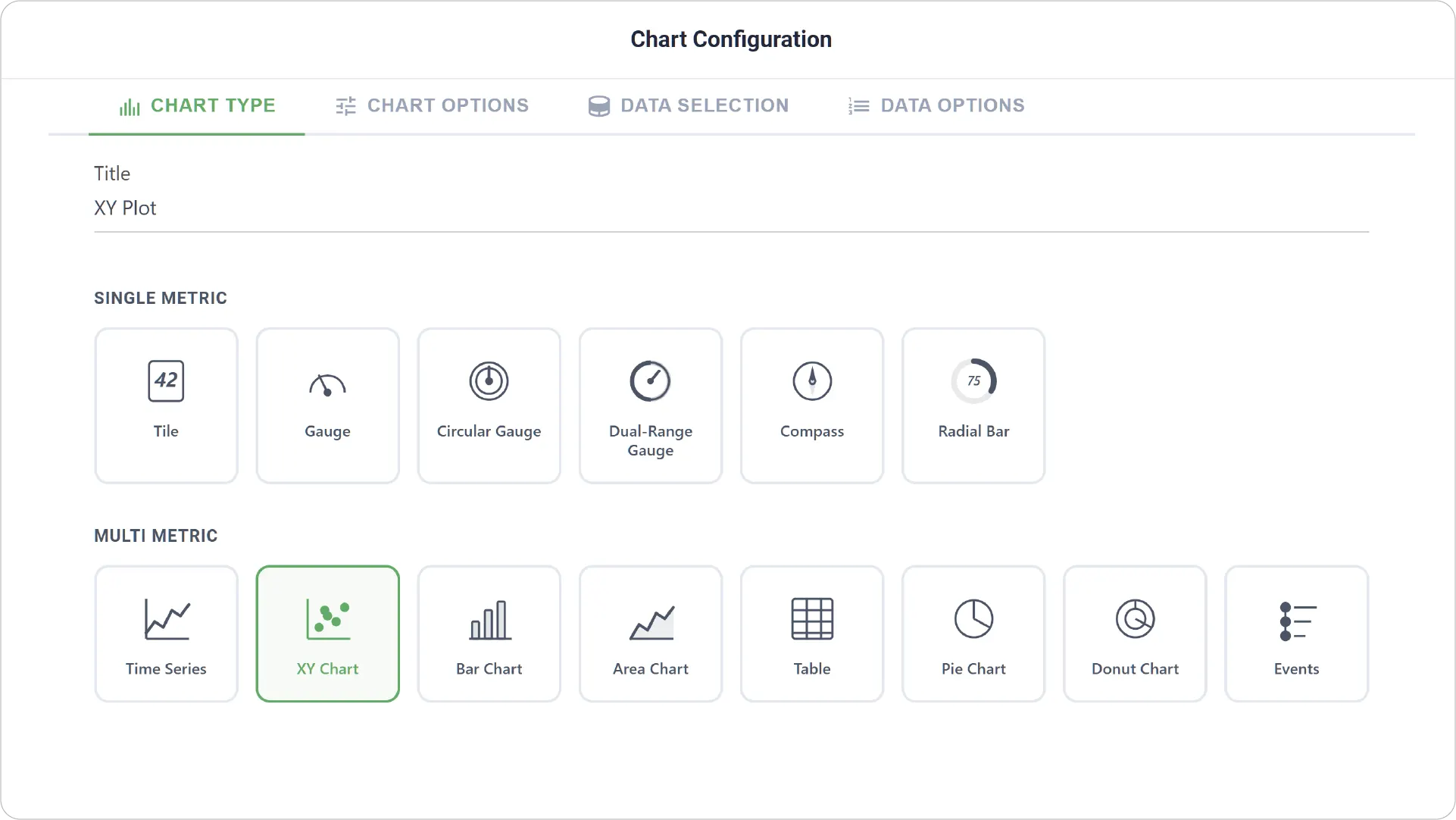
- Chart Type: Select the XY Chart type and provide a title for your chart.
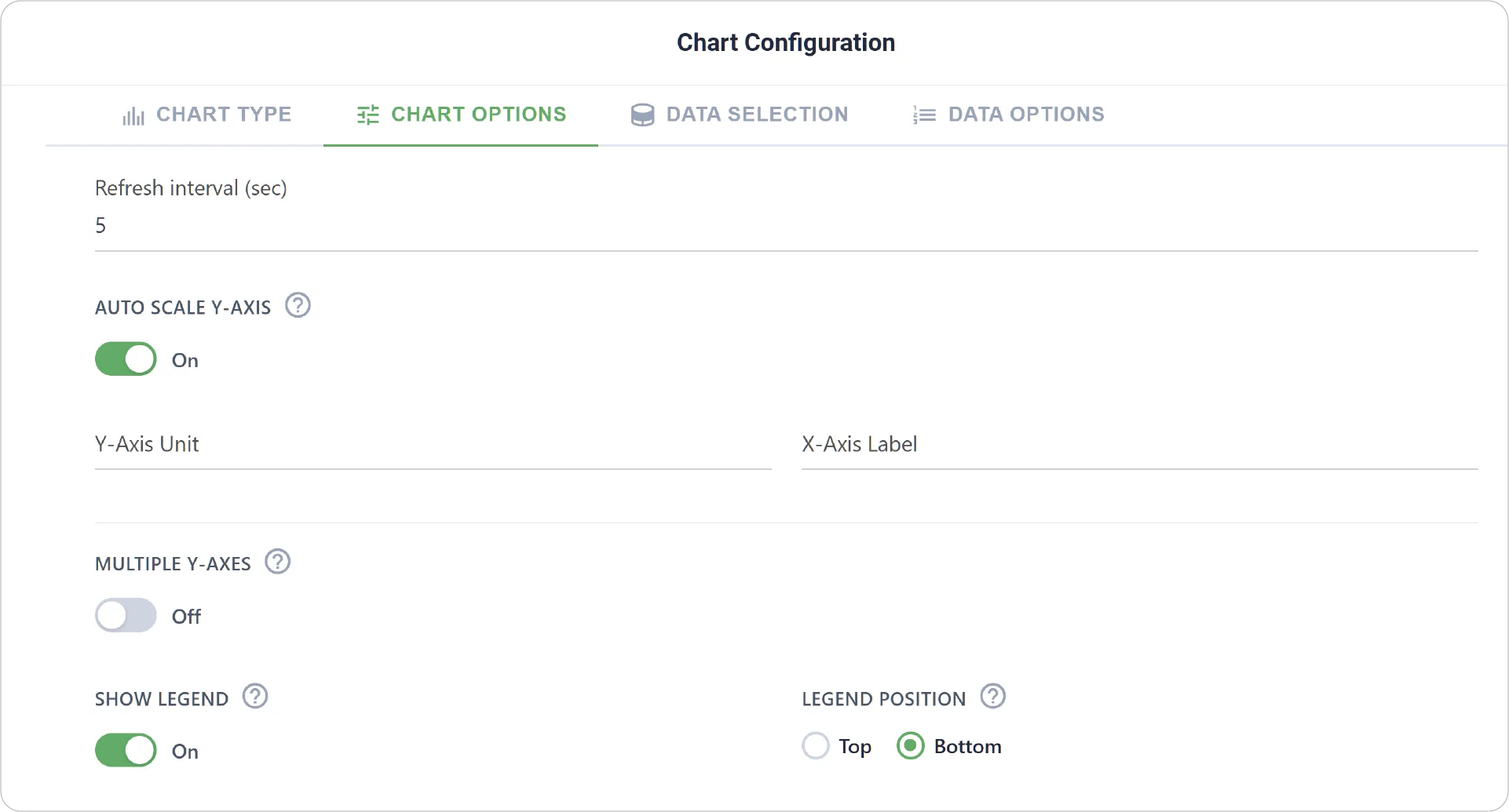
- Chart Options: Configure visual and structural elements, including axis settings and legend settings.
- Enable Link Dashboard to link this chart to another dashboard.
-
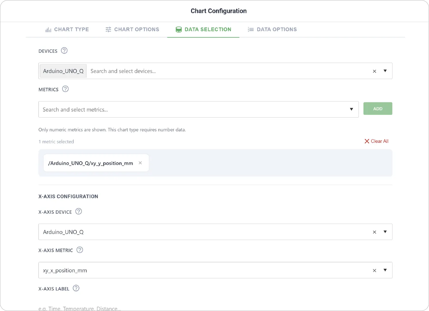
Data Selection: Define how data is mapped:
- Select the device
- Select one or more metrics for the Y-axis
- Choose a metric for the X-axis
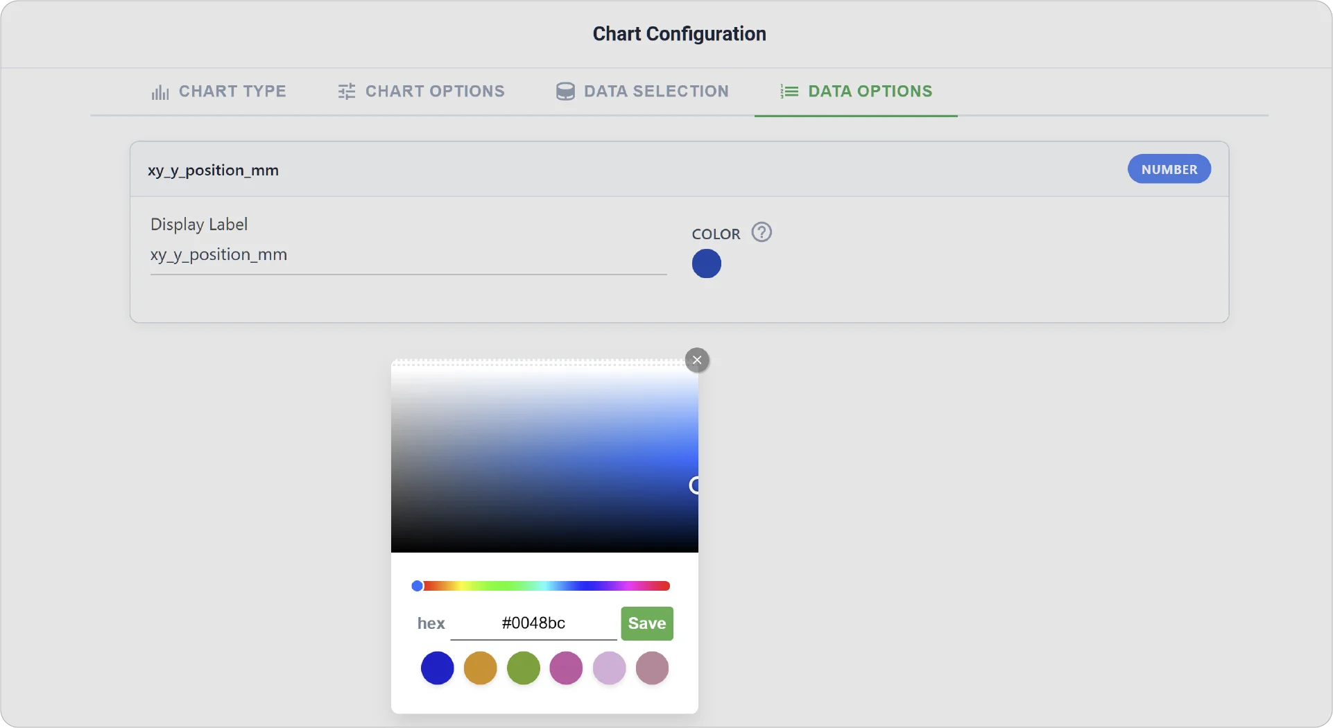
- Data Options: Customize display labels for clarity and assign colors to differentiate each metric.
Real-World Examples
-
Correlation Analysis Between Metrics
Analyze how temperature affects pressure or how speed impacts energy consumption.
-
Performance vs. Load Evaluation
Compare system performance metrics (e.g., latency) against load metrics (e.g., requests per second).
-
Sensor Relationship Exploration
Study how two or more sensor readings interact under different conditions.
Discover deeper insights into your data with the XY Chart. Explore more chart types to further expand your analytical capabilities.
Need help? Contact our support team: support@machinechat.io