Mastering Time Series Analysis with JEDI's Versatile Chart
Time Series Chart is a multi-metric, line-based visualization that displays multiple metrics over time on the same graph. It helps you compare trends, identify correlations, and analyze how different data points evolve simultaneously.
This chart is ideal for monitoring time-dependent data where understanding relationships between multiple metrics is important.
Key Features
-
Multi-metric visualization
Plot several metrics together on a single time axis
-
Trend comparison
Easily observe how different metrics behave over time
-
Flexible scaling options
Supports independent or shared Y-axis for better readability
-
Advanced readability controls
Customize how data is visually interpreted across multiple series
-
Historical data analysis
Easily view past data trends to analyze long-term patterns and performance changes
Configuration
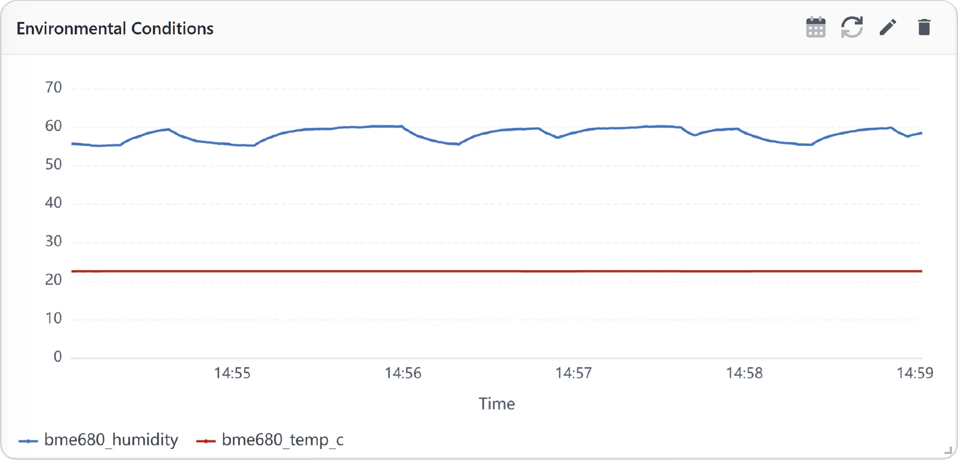
Time Series Chart for Grid Dashboard
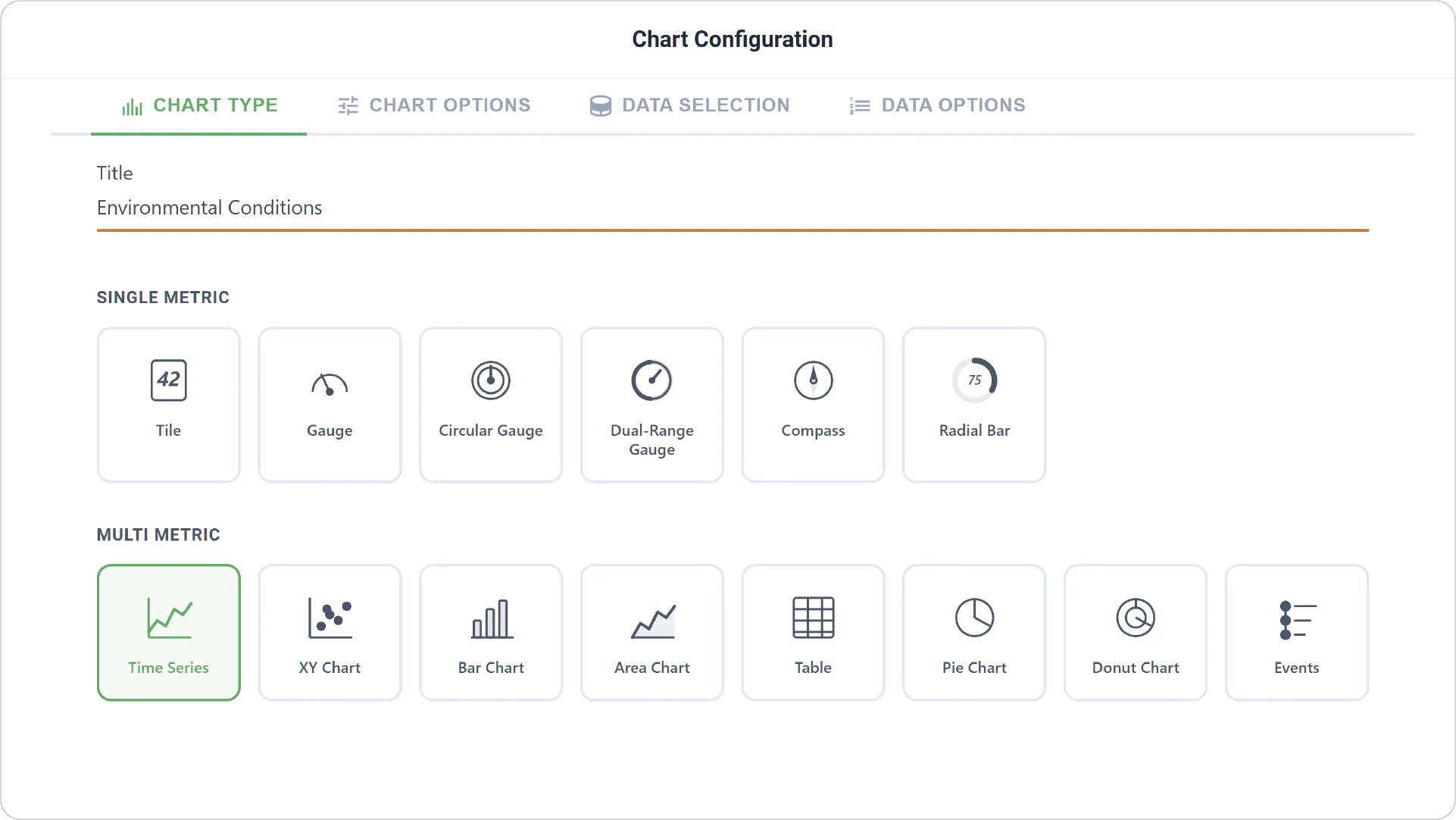
- Chart Type: Select the Time Series Chart type and define a clear title for the visualization.
-
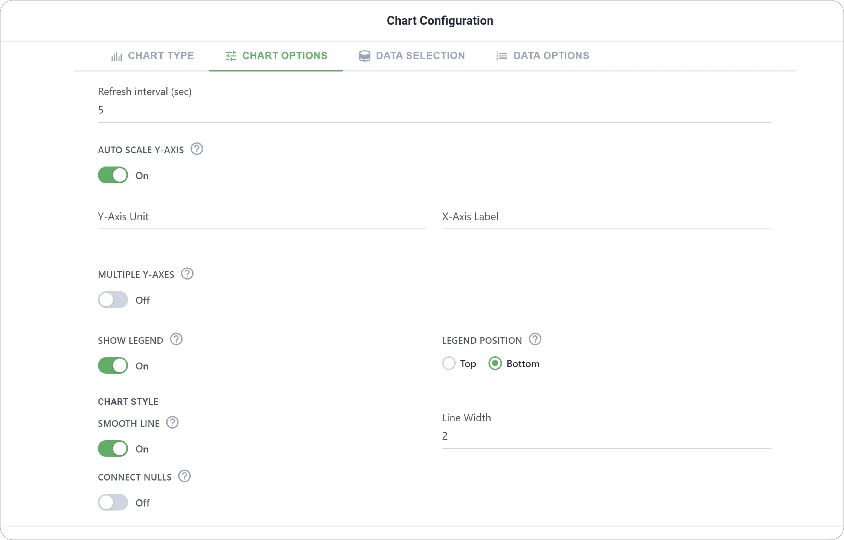
Advanced Chart Options: Configure visual behavior and appearance, including:
- Unit for Y-axis
- Auto-scale Y-axis to dynamically adjust value ranges
- Multiple Y-axes support for metrics with different scales
- Legend settings to show, hide, or position metric labels
- Chart style customization (line appearance and smoothing options)
- Line width adjustment for better visual clarity
- Null handling to connect or break lines when data points are missing
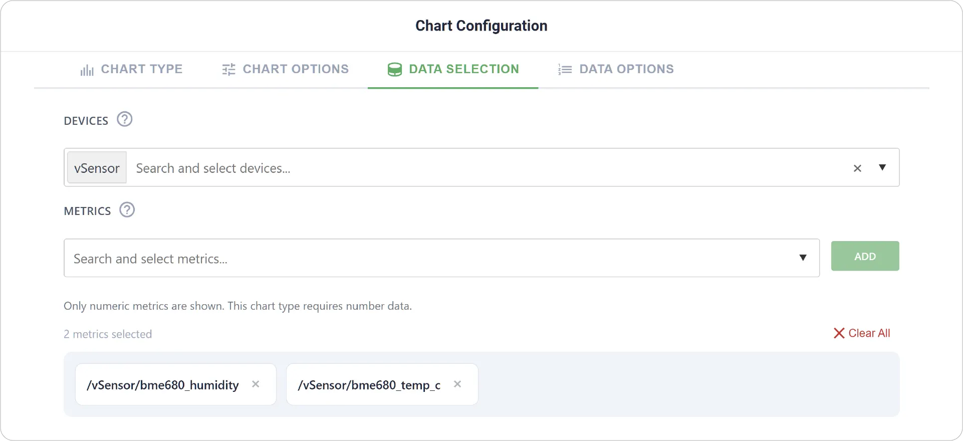
- Data Selection: Choose the device and select multiple metrics to plot on the same chart.
-
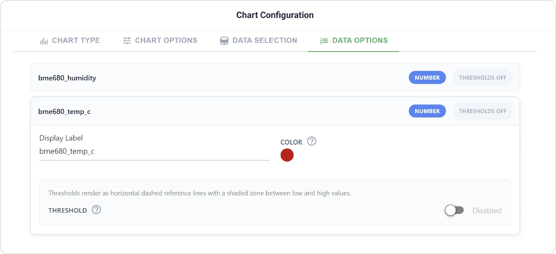
Advanced Data Options: Customize how each metric is displayed, including:
- Individual display labels for clarity
- Per-metric threshold configuration
- Low and high zone definitions for each metric to visually highlight performance ranges
Real-World Examples
-
Environmental Monitoring
Track temperature, humidity, and pressure together to analyze environmental conditions over time.
-
System Performance Analysis
Compare CPU usage, memory usage, and network activity to understand system behavior.
-
Industrial Process Tracking
Monitor multiple sensor readings (e.g., vibration, speed, temperature) to detect anomalies or inefficiencies.
Unlock deeper insights into your data with the Time Series Chart. Explore other chart guides to further enhance your dashboard capabilities.
Need help? Contact our support team: support@machinechat.io