Build an Environmental Monitoring Grid Dashboard Step-by-Step
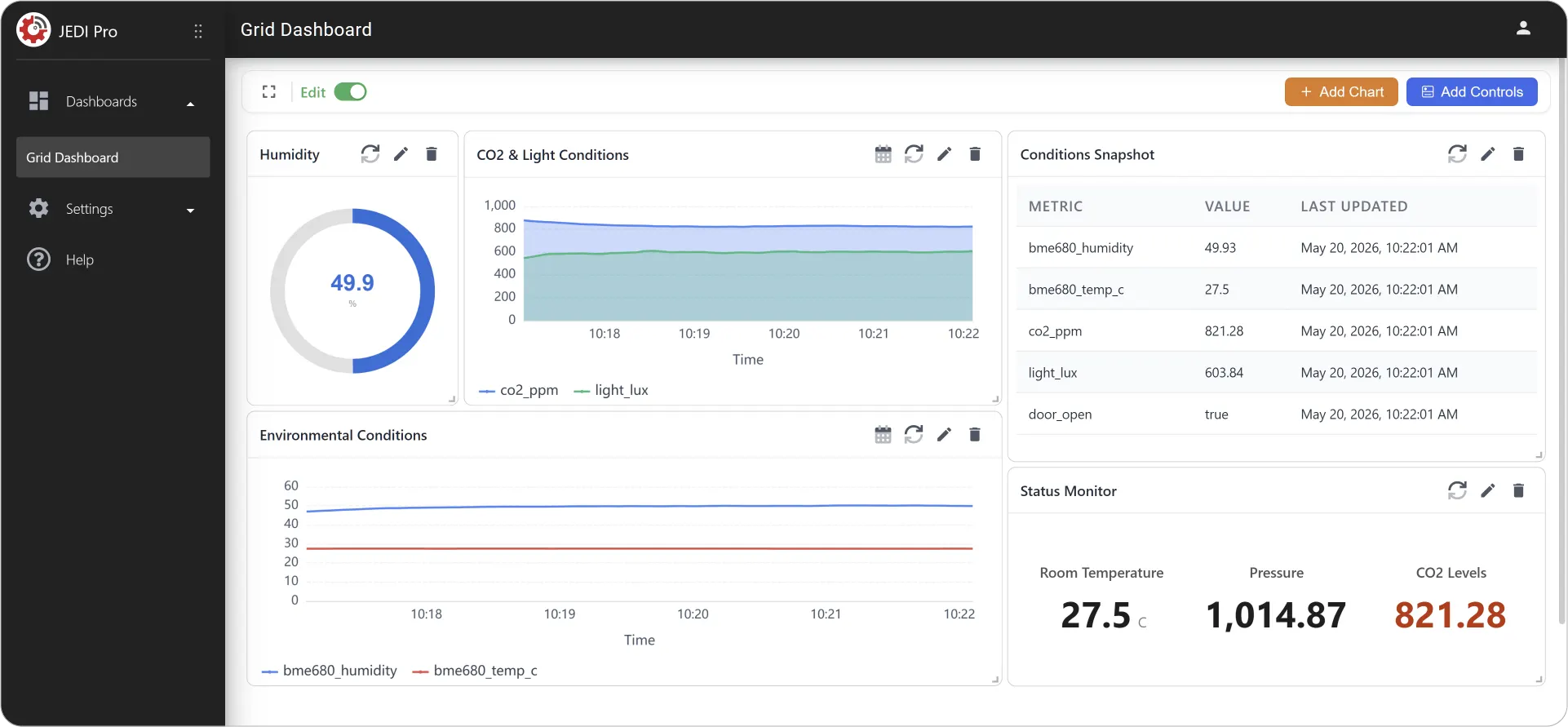
In this guide, you will learn how to build a comprehensive dashboard using a variety of chart types. You can build this dashboard using data from your own devices or by using JEDI’s built-in IoT Simulator. For the purposes of this guide, the IoT Simulator has been used.
Step 1: Verify Data Reception
- Once you're logged in, go to Settings Devices.
- Click on the listed device to check JEDI is receiving data from the Simulator.
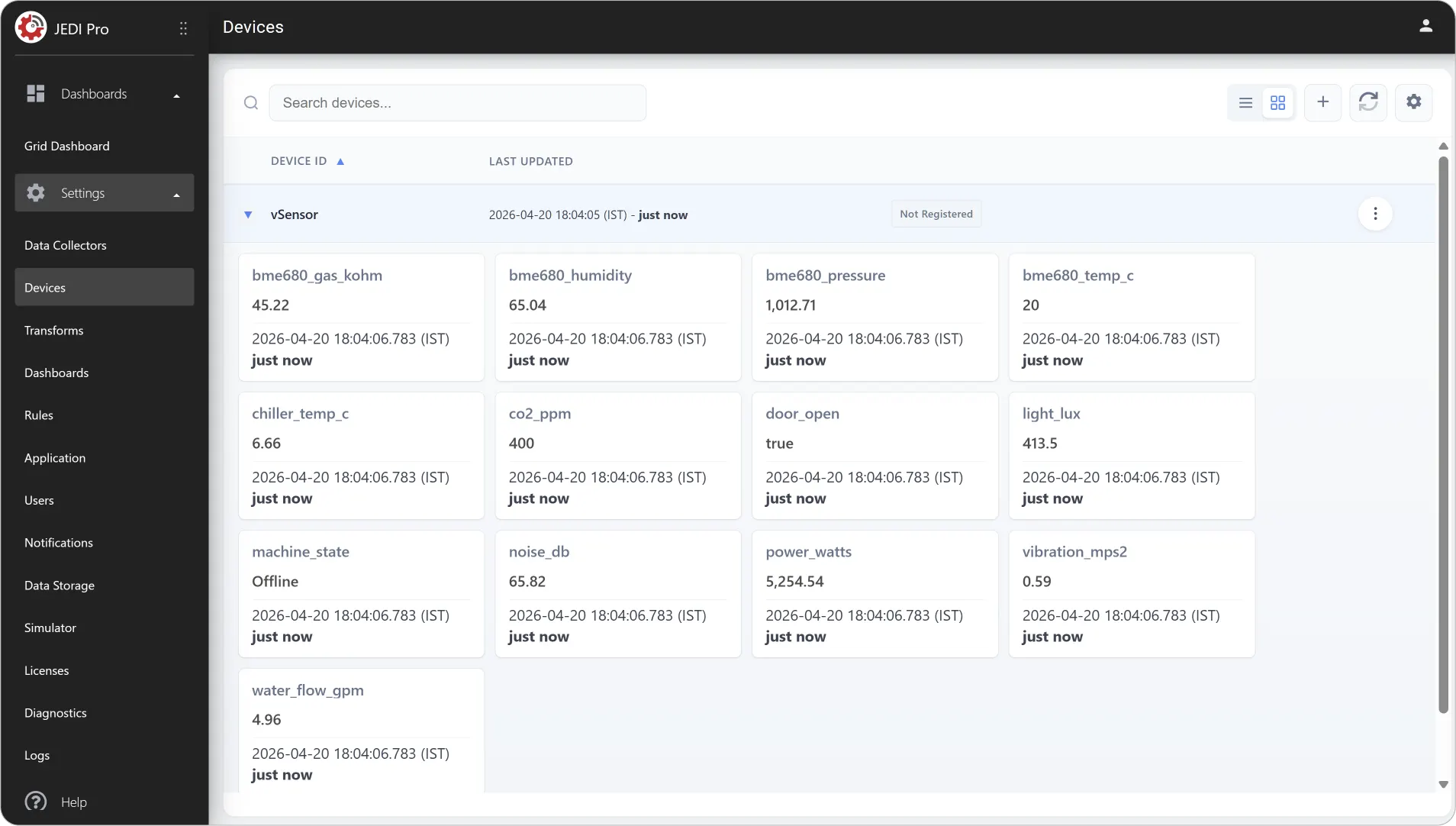
Note
If you are not receiving data, go to Settings Simulator and click Start Simulator to begin generating data.
Step 2: Add Your First Chart
Let us start with a single-metric chart: Gauge. Gauge Chart allows you to display a single metric in a visually intuitive way, often representing progress or status within a defined range.
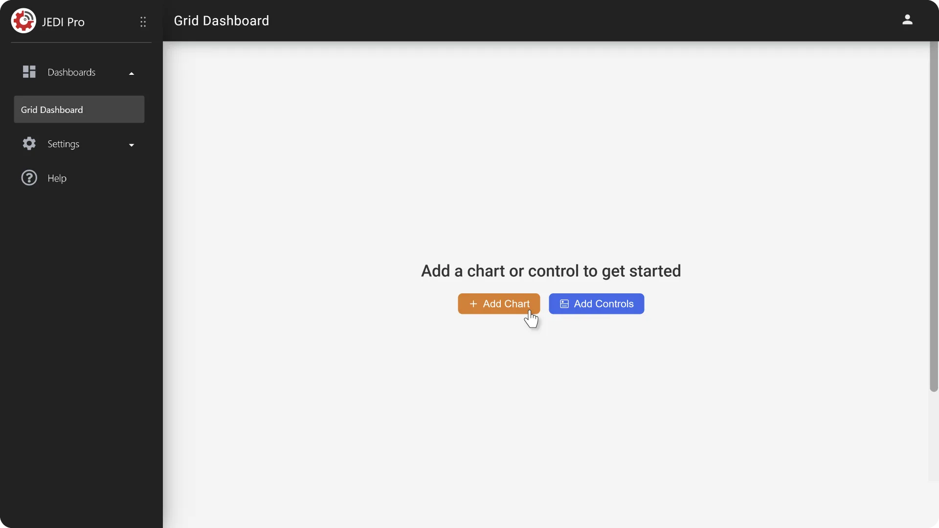
1. Go to Grid Dashboard and click on Add Chart.
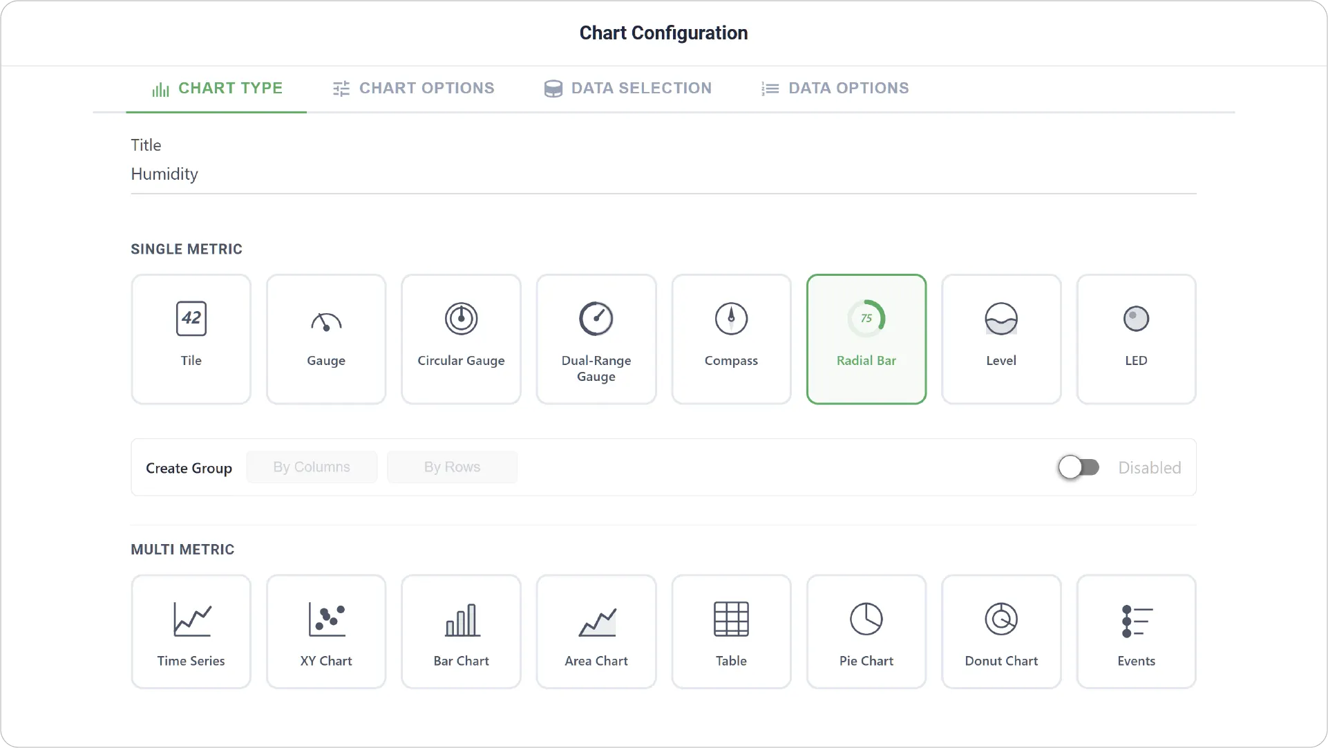
2. In Chart Type tab, choose your chart type as Radial Bar and add your title.
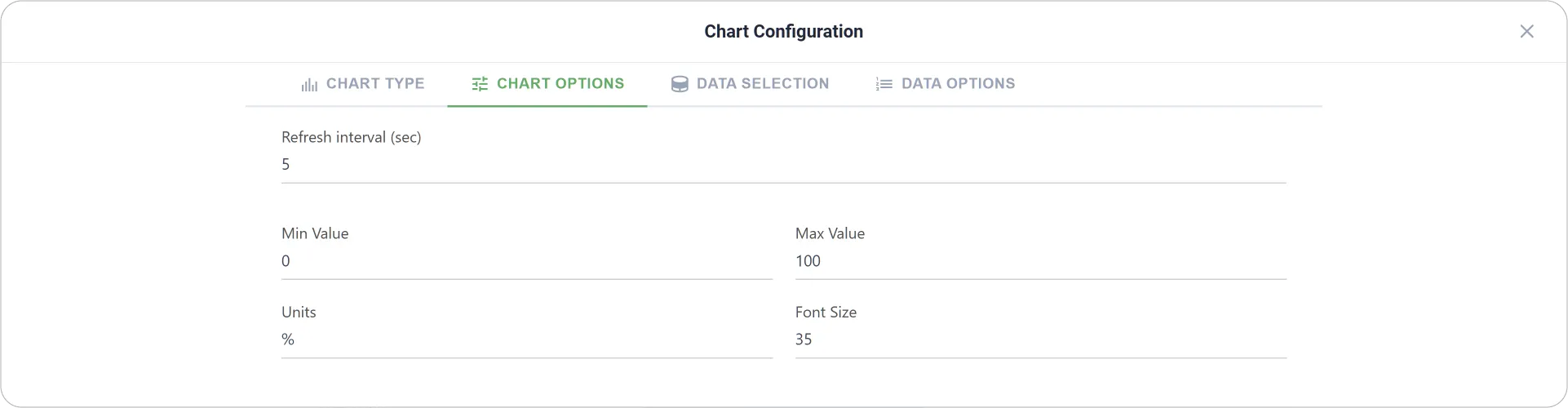
3. In Chart Options tab, enter Units and Font Size.
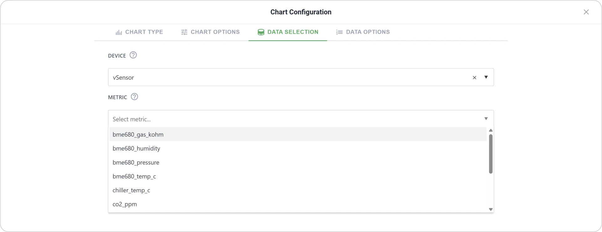
4. In Data Selection tab, choose your Device and Metric.
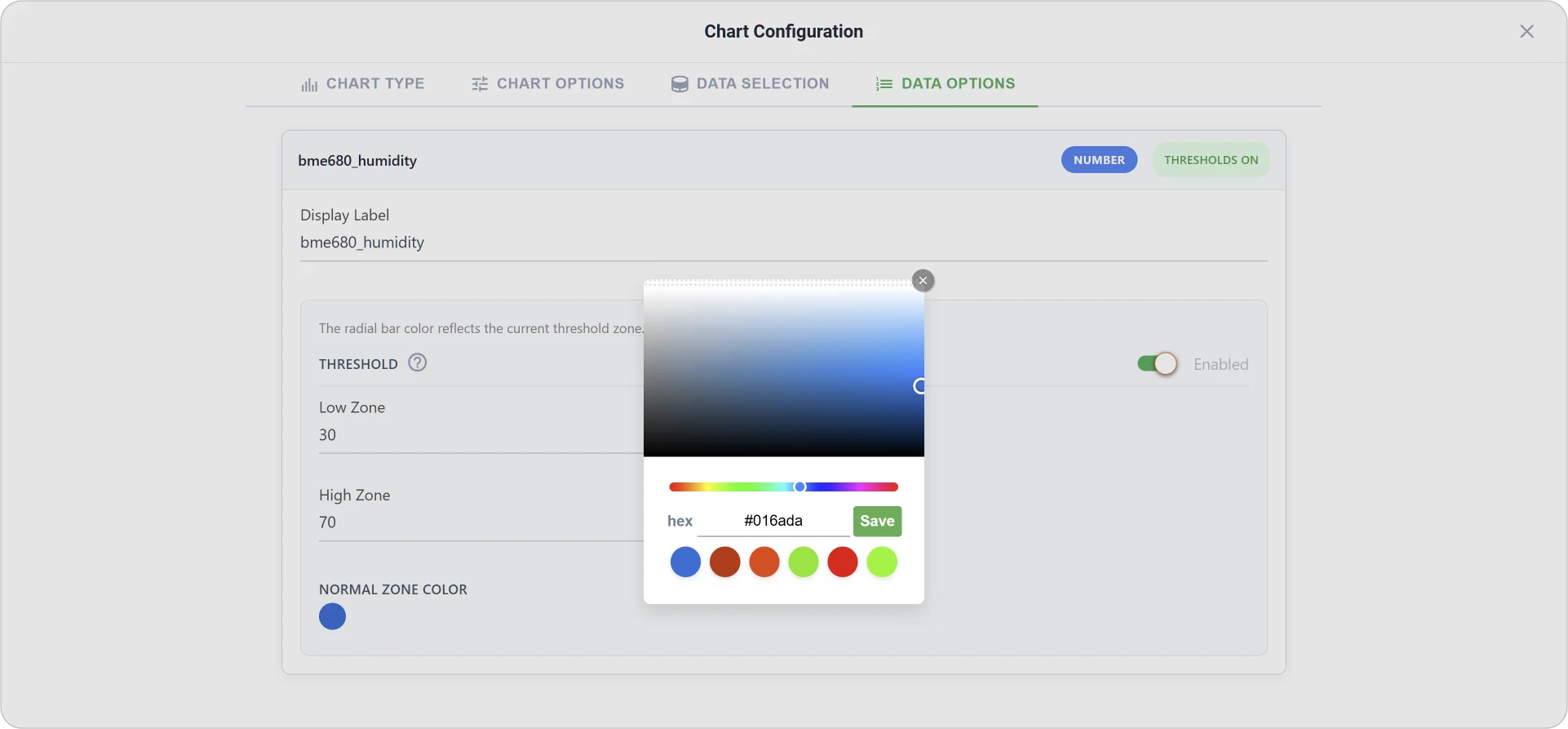
5. Under Data Options tab, you can customize further by enabling Threshold and editing zones and colors.
6. Save the Chart Configuration to add your first chart.
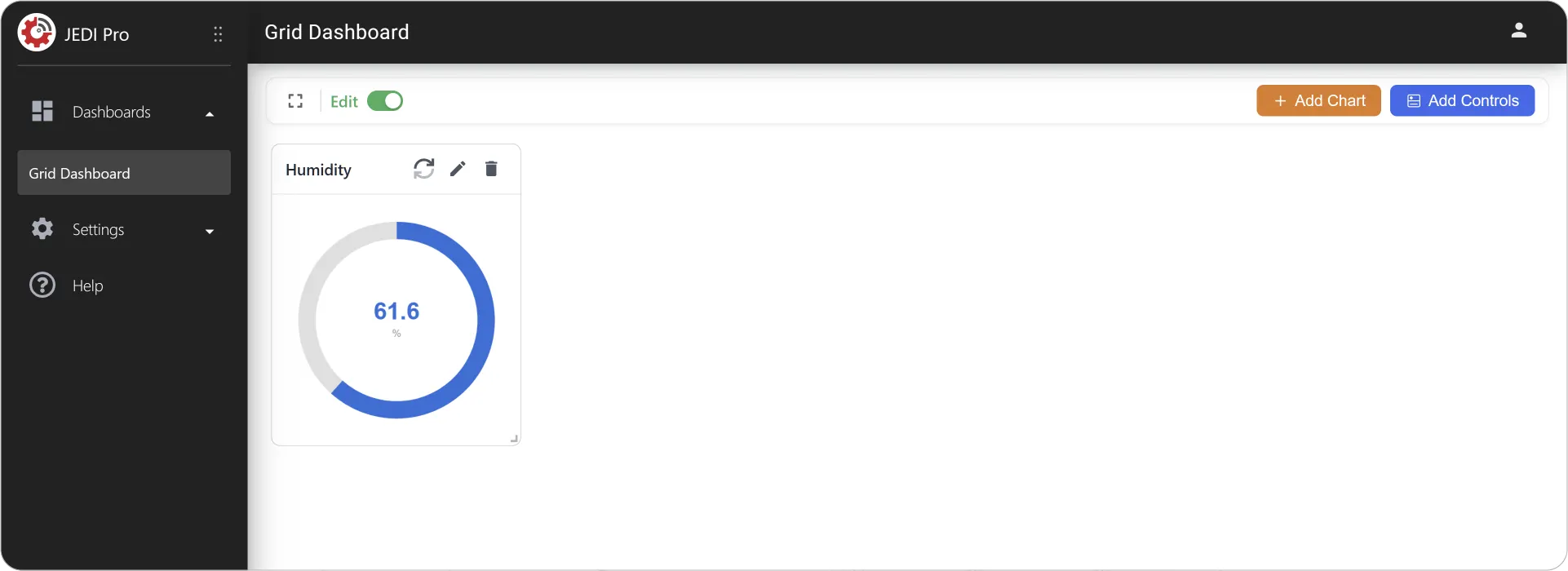
Congratulations! You've added your first chart to the dashboard. Now let's add a few more charts.
Step 3: Add Grouped Charts
You can use Tile Charts to display any metric data type—numeric, Boolean, and string. In this section, we will create a numeric grouped Tile Chart.
1. Click on Add Chart again. Select Tile, enter Title, and enable Create Group.
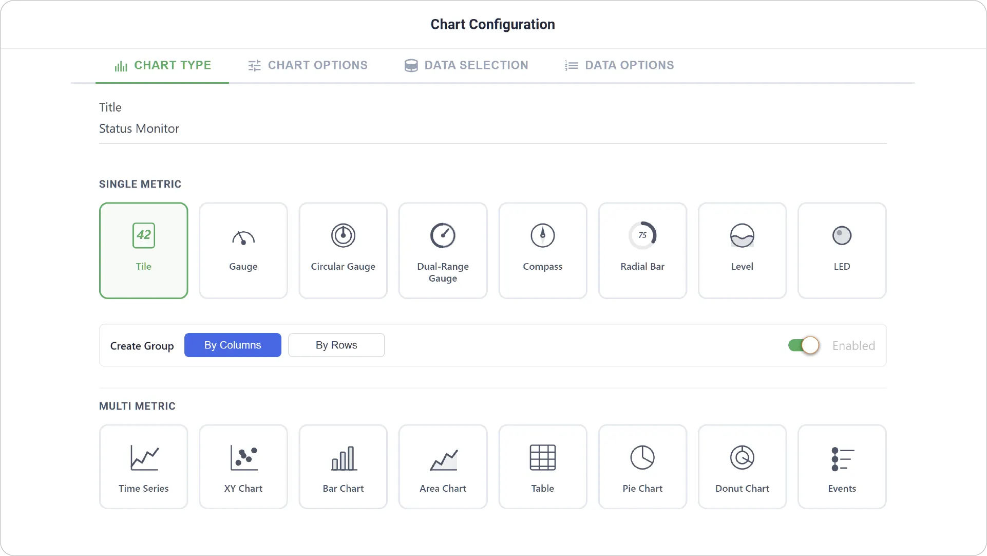
2. In the Data Selection tab, click Add Item and choose your Device and Metric.
3. Turn on Threshold to customize the display further.
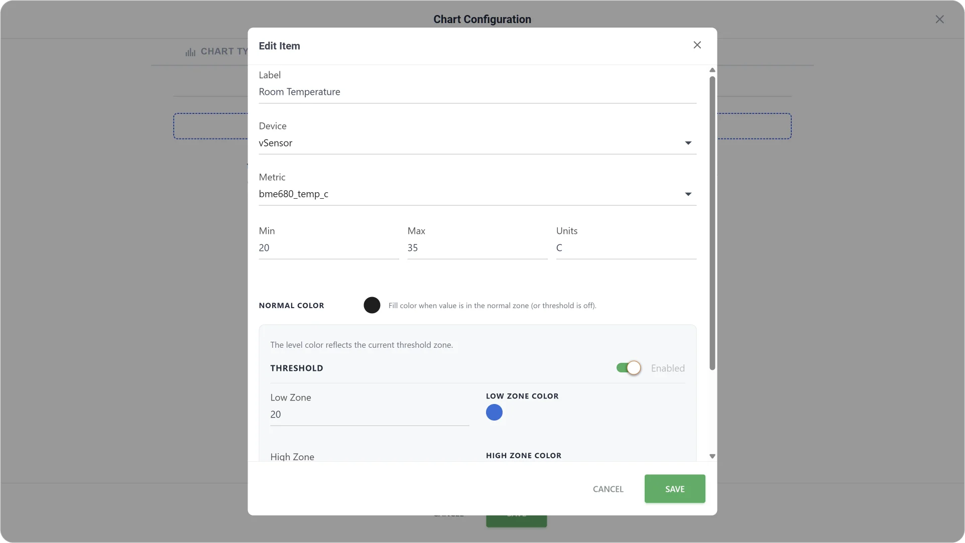
4. Add more relevant Metrics.
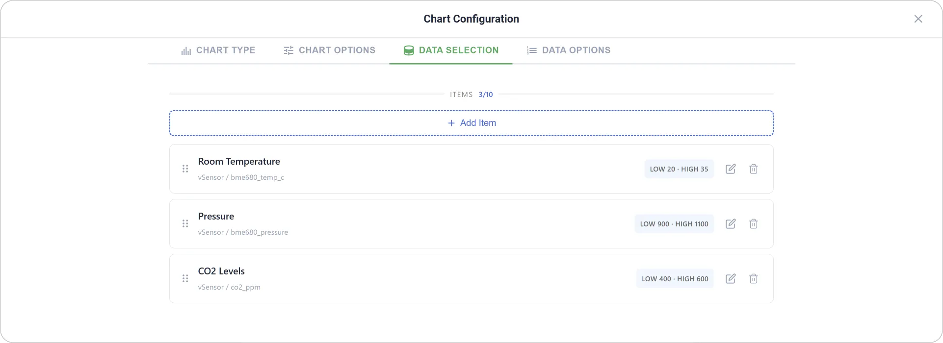
5. Save the Chart Configuration.
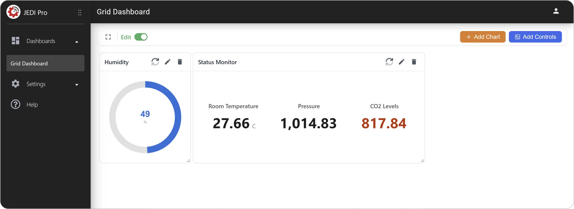
That's your second and third chart on the dashboard. Let's get a bit more adventurous.
Step 4: Add Multi-Metric Charts
Now, let us create two multi-metric charts: a Time Series Chart and an Area Chart. Multi-metric charts allow you to visualize and compare multiple data streams within a single chart.
1. Click on Add Chart again, select Time Series as chart type, and add your Title.
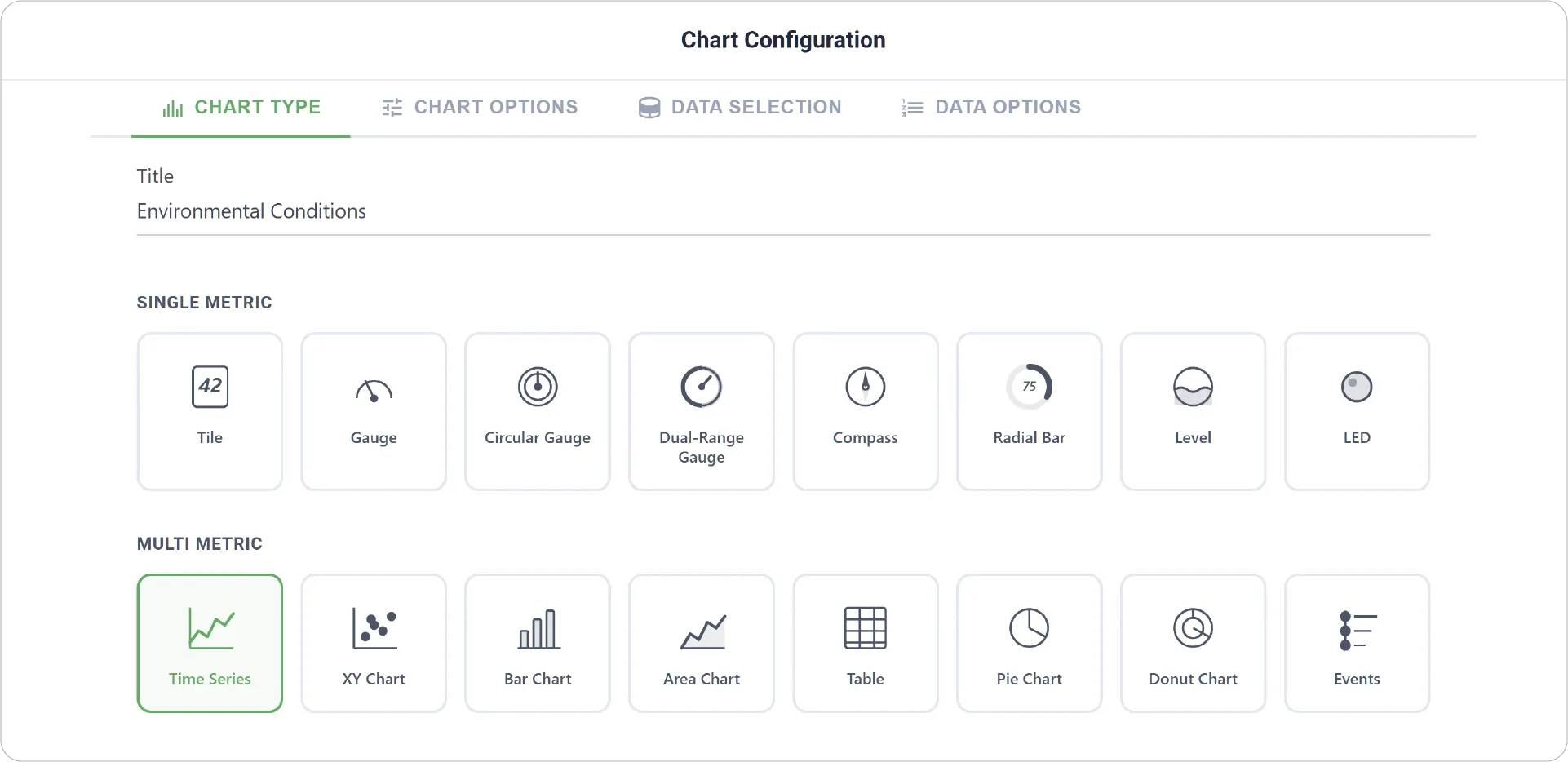
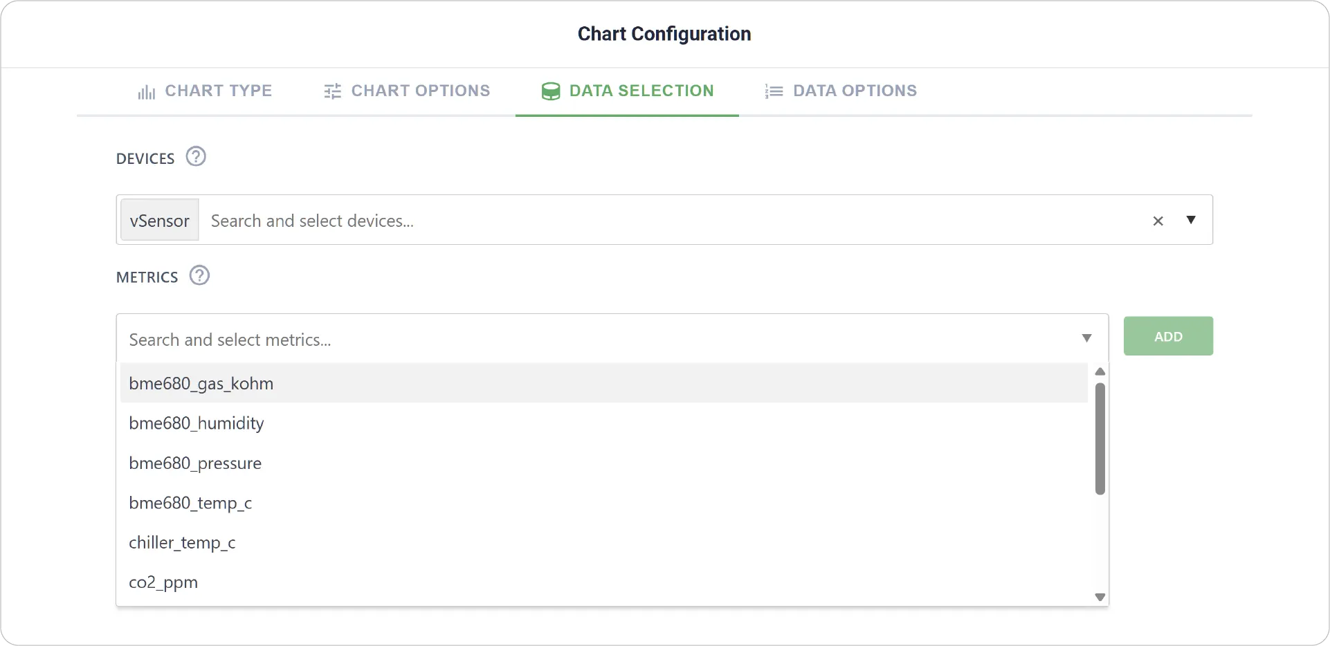
2. In Data Selection, select your Device and relevant Metrics. Click Add
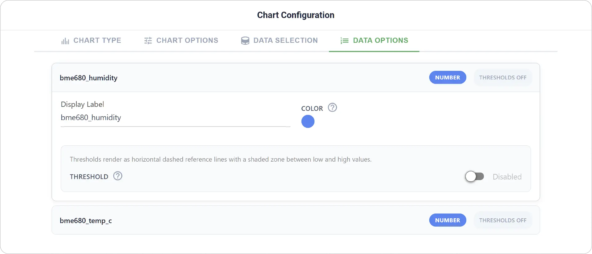
3. Pick a Color for each metric in Data Options.
4. Save your Chart Configuration and adjust its size and position.
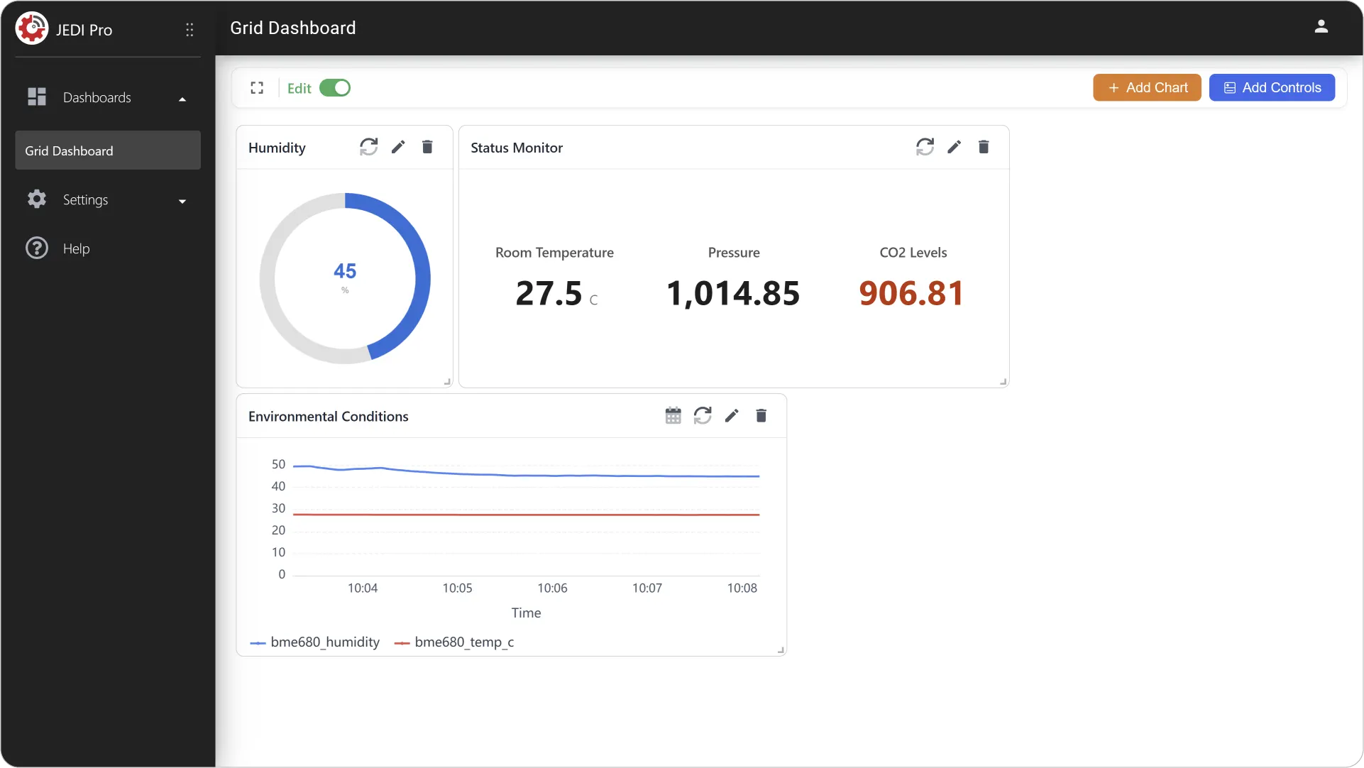
5. Repeat the steps to add a new Area Chart.
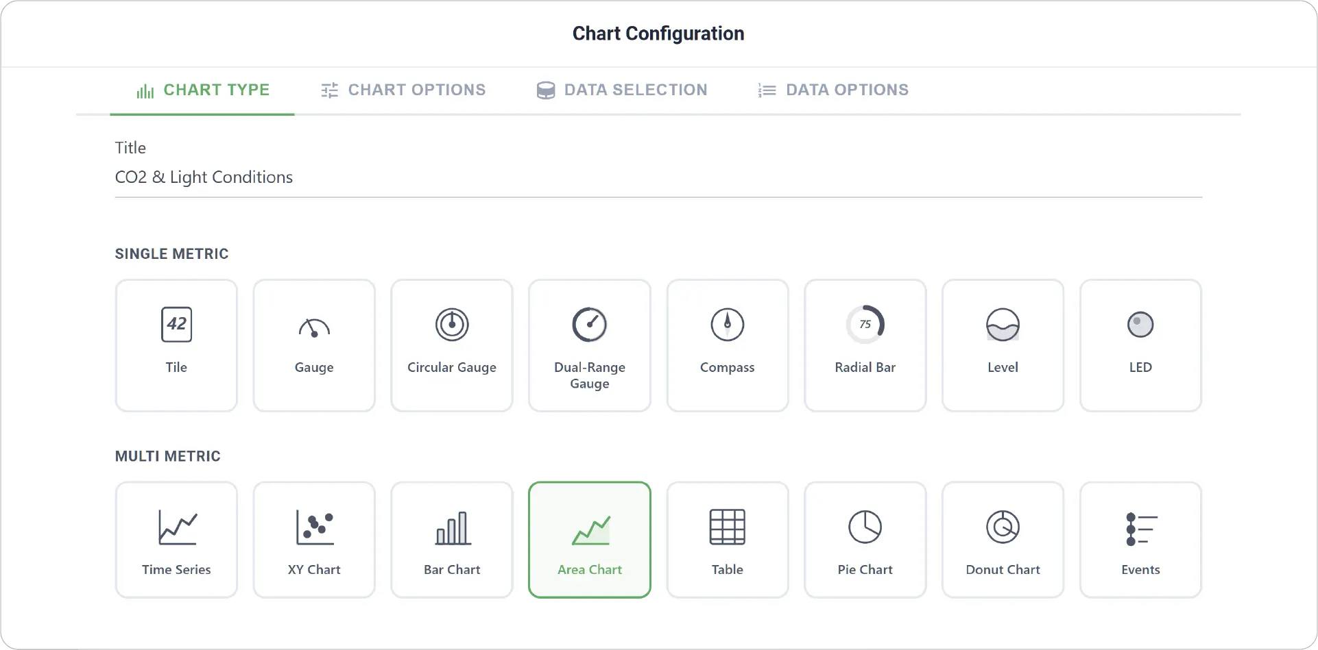
6. Save and adjust the chart as needed.
Step 4: Add Table Chart
Finally, let us create a Table Chart. Table Chart allows you to display multiple metrics in a structured, row-and-column format, ideal for viewing precise values and comparing metrics at a glance.
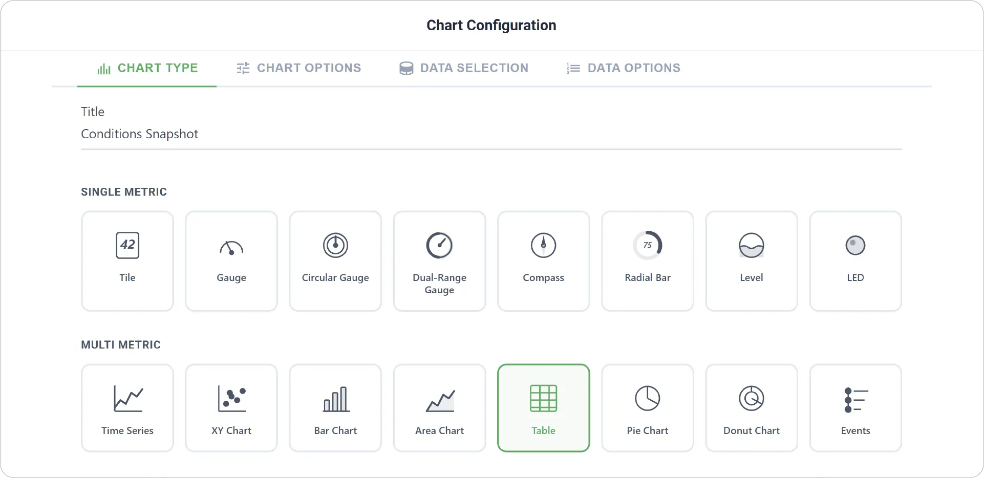
1. Click on Add Chart and choose Table as Chart Type.
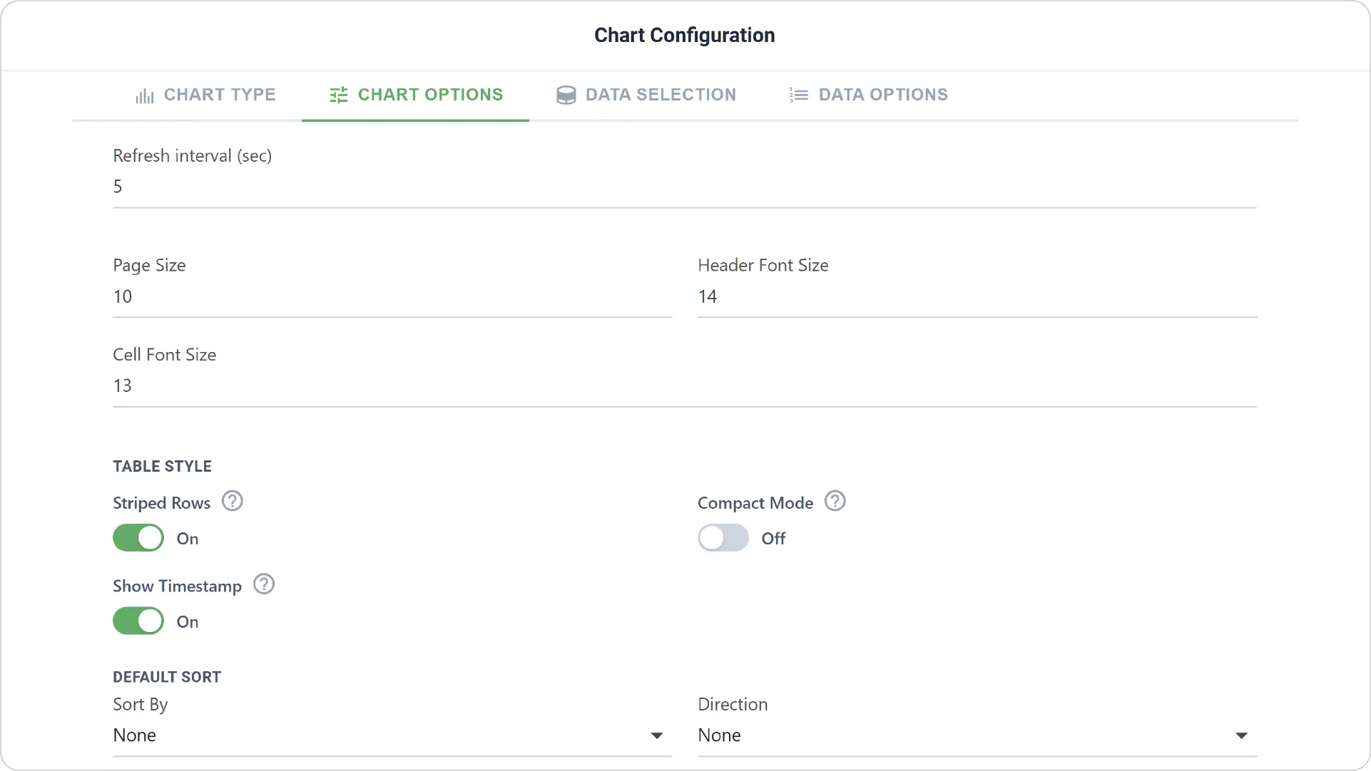
2. In Chart Options tab, enable Show Timestamp.
3. In Data Selection tab, choose Metrics as first column.
4. Select your Devices and relevant Metrics, and click Add
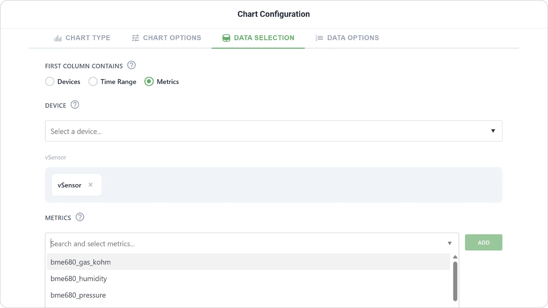
5. Save your configuration and resize the Table as needed.
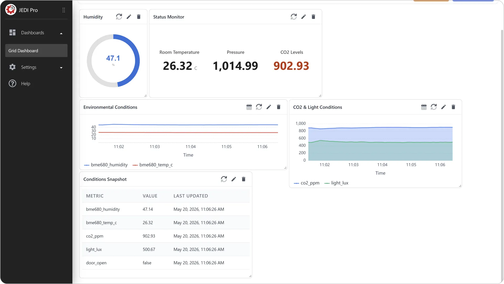
Step 6: Adjust for Visual Hierarchy
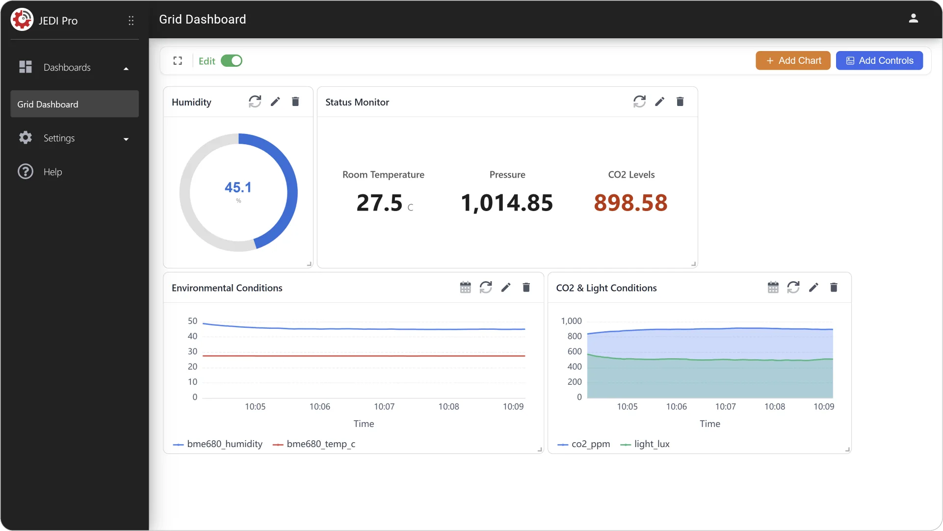
Move and resize the charts in your Grid Dashboard to create a meaningful visual hierarchy.
This Is Just the Beginning!
Customize and Experiment
As you continue to work with the dashboard, don’t hesitate to customize and experiment. The most effective dashboards are those that evolve alongside your data and your goals.
- Adjust Chart Configuration: Modify titles, labels, font sizes, and colors to improve readability.
- Experiment with Different Metrics: Swap or add metrics to see which choices provide meaningful insights.
- Use Different Chart Types: Try visualizing the same data in multiple formats.
Congratulations! You've Unleashed the Power of Data Visualization!
You have now created a complete dashboard that brings together multiple chart types to visualize your data in meaningful ways. By leveraging both single-metric and multi-metric charts, you can monitor real-time conditions, compare trends, and analyze detailed values—all within one unified view.
Need help? Contact our support team: support@machinechat.io