Compare Metrics Side by Side with JEDI's Bar Chart
Bar Chart gives a categorical visualization that displays multiple metrics as rectangular bars, making it easy to compare values across different categories or metrics at a glance. Each bar represents a metric, allowing for clear visual differentiation and comparison.
This chart is ideal for scenarios where you want to evaluate differences in magnitude between multiple data points rather than track trends over time.
Key Features
-
Clear Value Representation
Bar lengths provide an immediate visual indication of magnitude
-
Multi-Metric Display
Supports multiple metrics within a single chart
-
Side-By-Side Comparison
Displays multiple metrics next to each other for easy comparison
-
Quick Insight Generation
Enables fast identification of highest and lowest values
Configuration
Bar Chart for Grid Dashboard
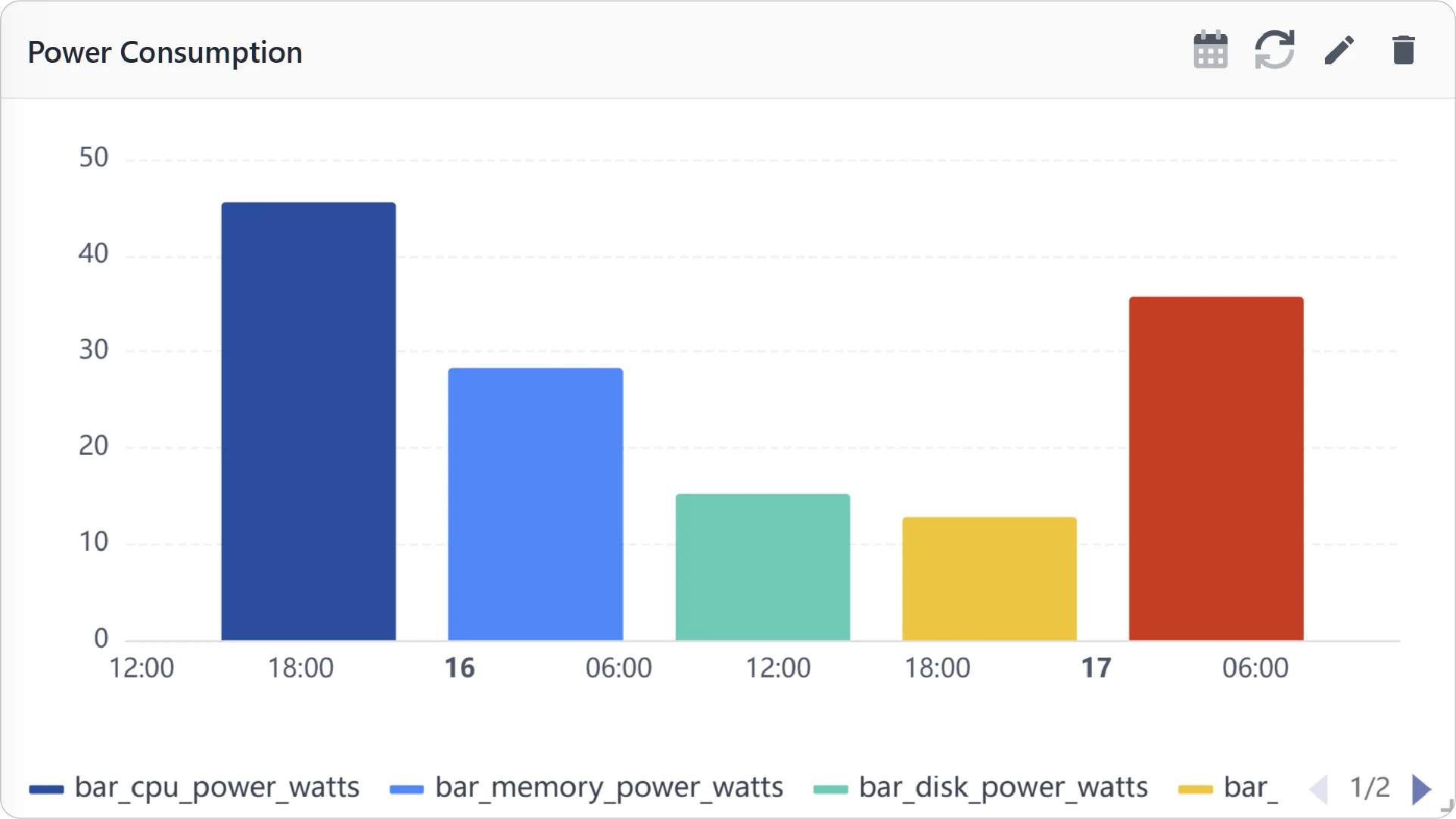
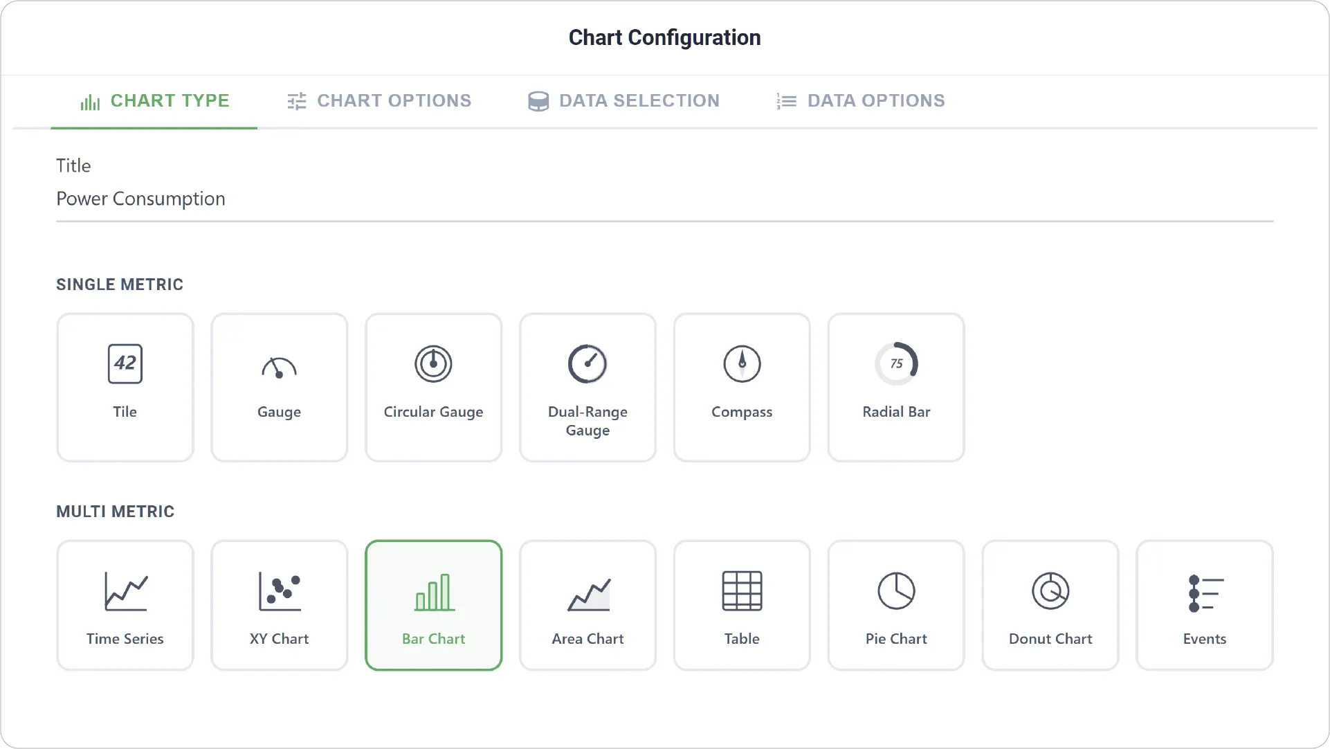
- Chart Type: Select the Bar Chart type and provide a title for your chart.
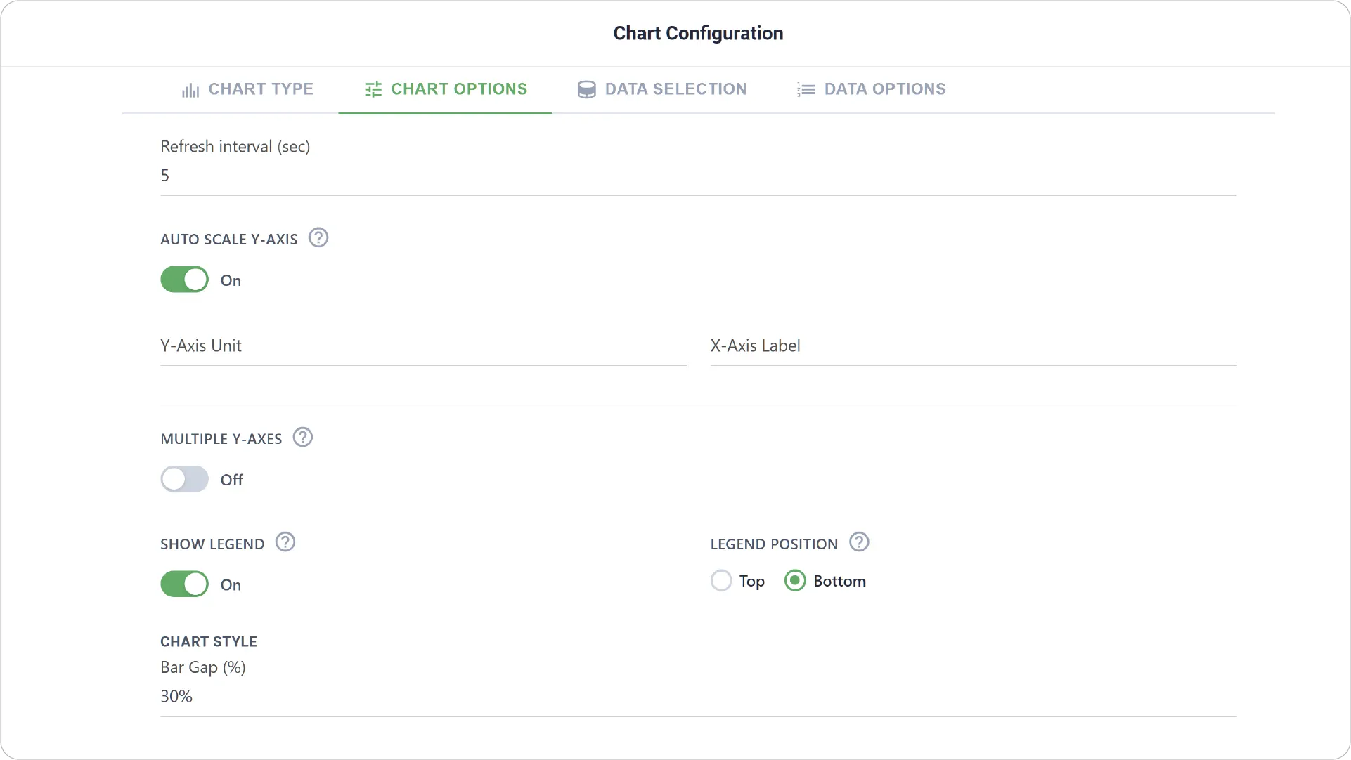
- Chart Options: Configure visual structure and layout, including axis settings and legend settings
- Enable Link Dashboard to link this chart to another dashboard.
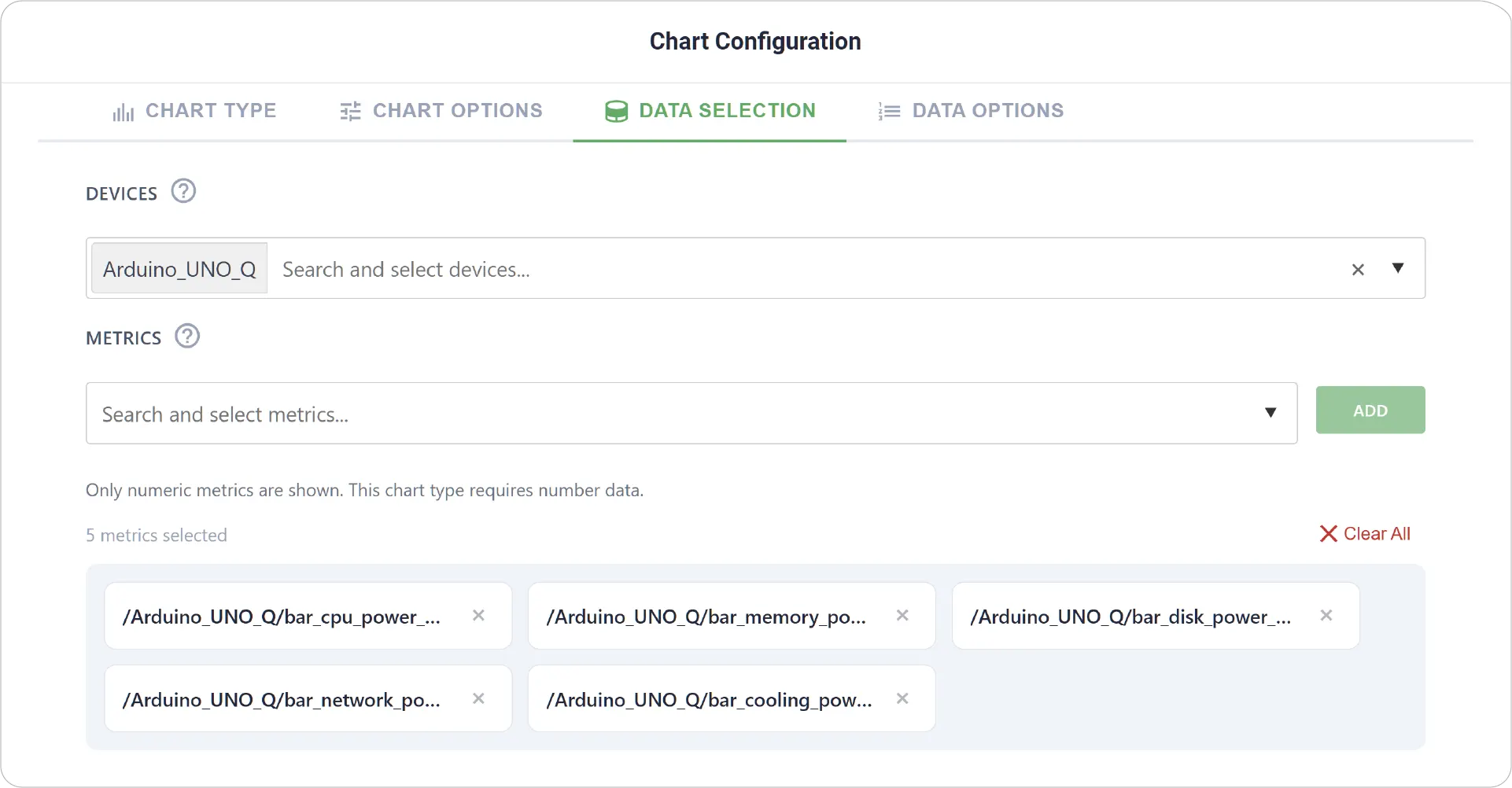
- Data Selection: Choose the device and select the relevant metrics to display as bars.
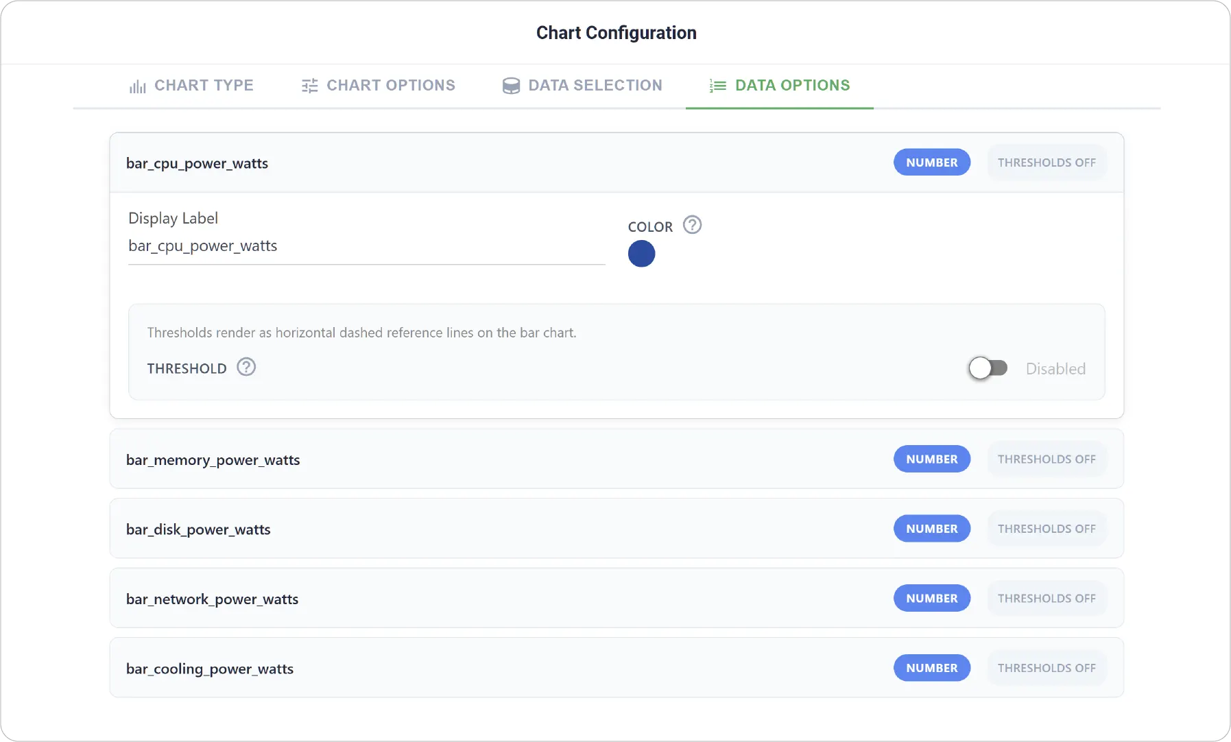
- Data Options: Customize display labels, colors and threshold zones (low and high ranges).
Real-World Examples
-
Device Performance Benchmarking
Compare key performance indicators such as CPU usage, memory consumption, or response time across multiple devices.
-
System Load Distribution Analysis
Visualize how workload or processing load is distributed across services or components.
-
Operational Efficiency Tracking
Compare efficiency-related metrics across shifts, machines, or production units.
Make comparisons simple and effective with the Bar Chart. Explore additional chart types to create more dynamic and insightful dashboards.
Need help? Contact our support team: support@machinechat.io