Visualize Liquid Levels with JEDI's Level Chart
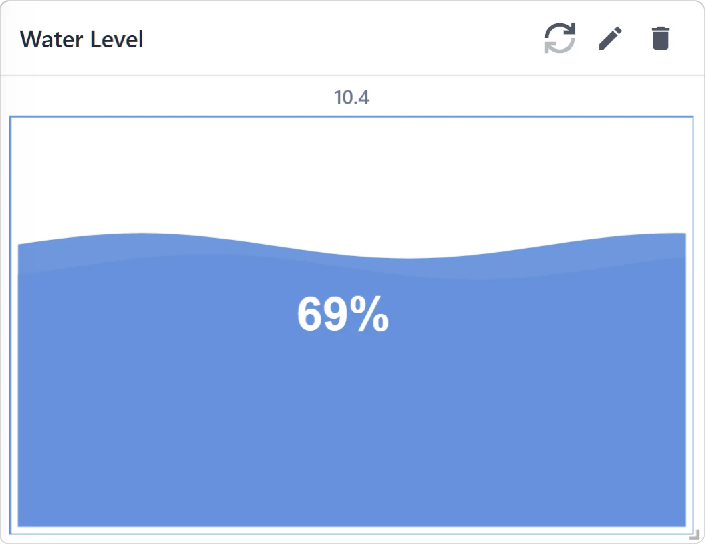
The Level Chart displays real-time data using an animated liquid fill effect. Ideal for monitoring capacity, utilization, or other levels-based metrics, the chart provides an intuitive visual representation of how full or empty a monitored system is at any moment.
Key Features:
-
Real-Time Liquid Level Visualization
Display live metric values with a dynamic liquid fill animation that makes monitoring more intuitive and visually engaging.
-
Customizable Appearance
Choose between circular or vertical bar-style, adjust fill colors, labels, and units to create charts that align with your preferences.
-
Configurable Value Ranges
Define custom minimum and maximum values to accurately represent metric ranges and threshold behavior.
Configuration
Level Chart for Grid Dashboard
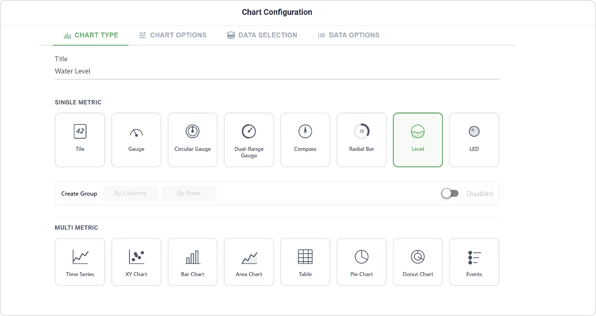
- Chart Type: Set a custom name for the chart and select the Level Chart visualization type.
- Create Group: Enable grouping to display multiple Level Charts together either by row or column layout.
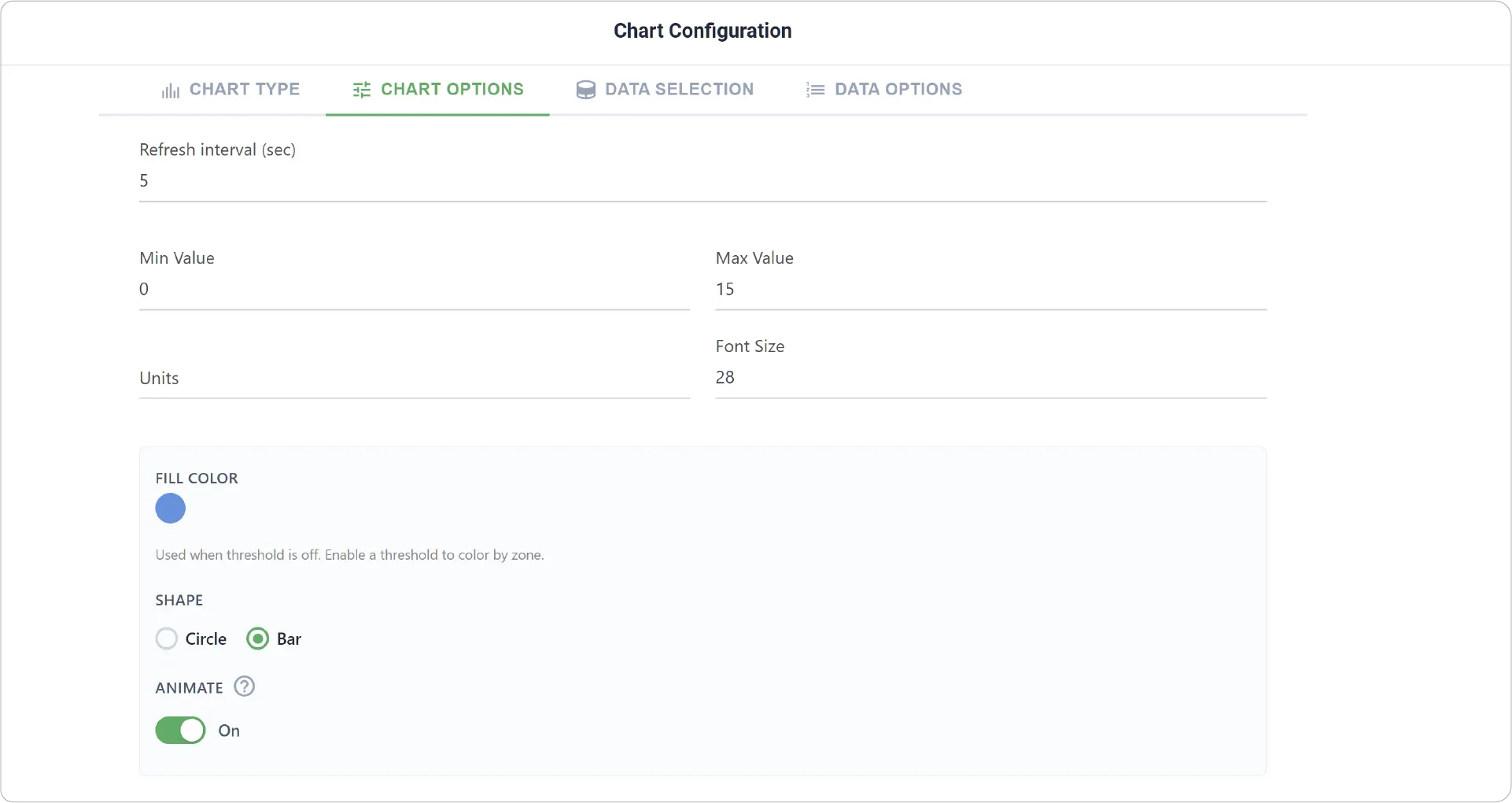
- Chart Options: Customize the settings with Refresh Interval, Min and Max Values, Units, Fill Color, Shape (Circle or Bar), and Animate (enable or disable).
- Create Group Settings: Available when Create Group is enabled. Set Label Font Size for each grouped Level Chart.
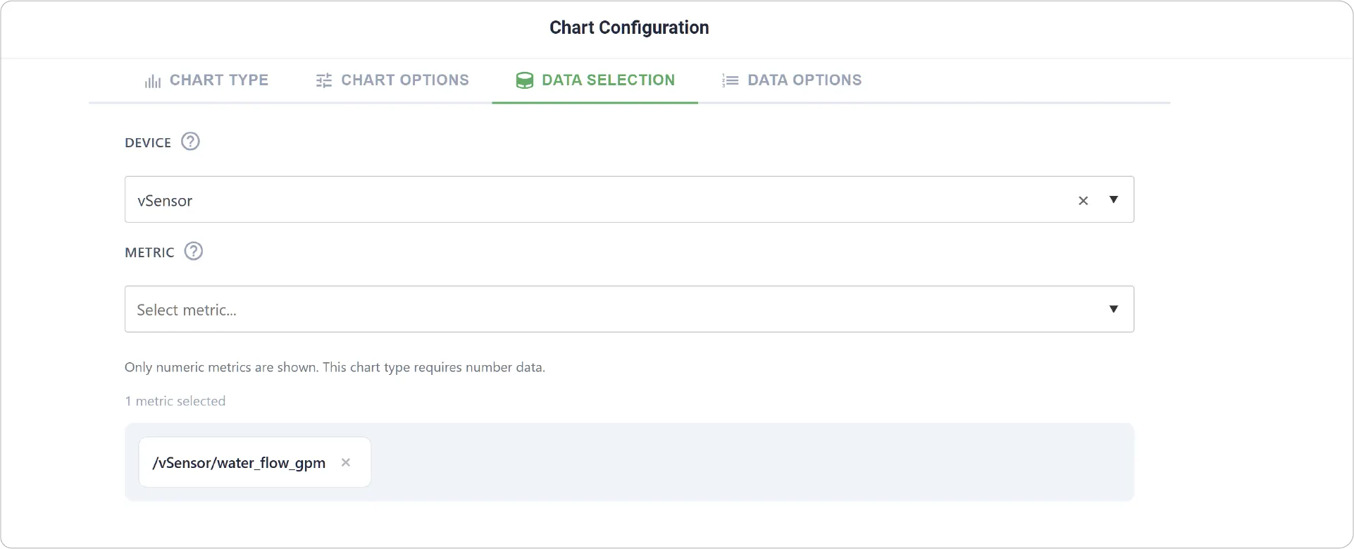
- Data Selection: Choose the devices and metrics to visualize.
- Add Item: Available when grouping is enabled, allowing addition of multiple Level indicators along with Fill Color, Min-Max Values, Units, and Threshold settings for each Metric.
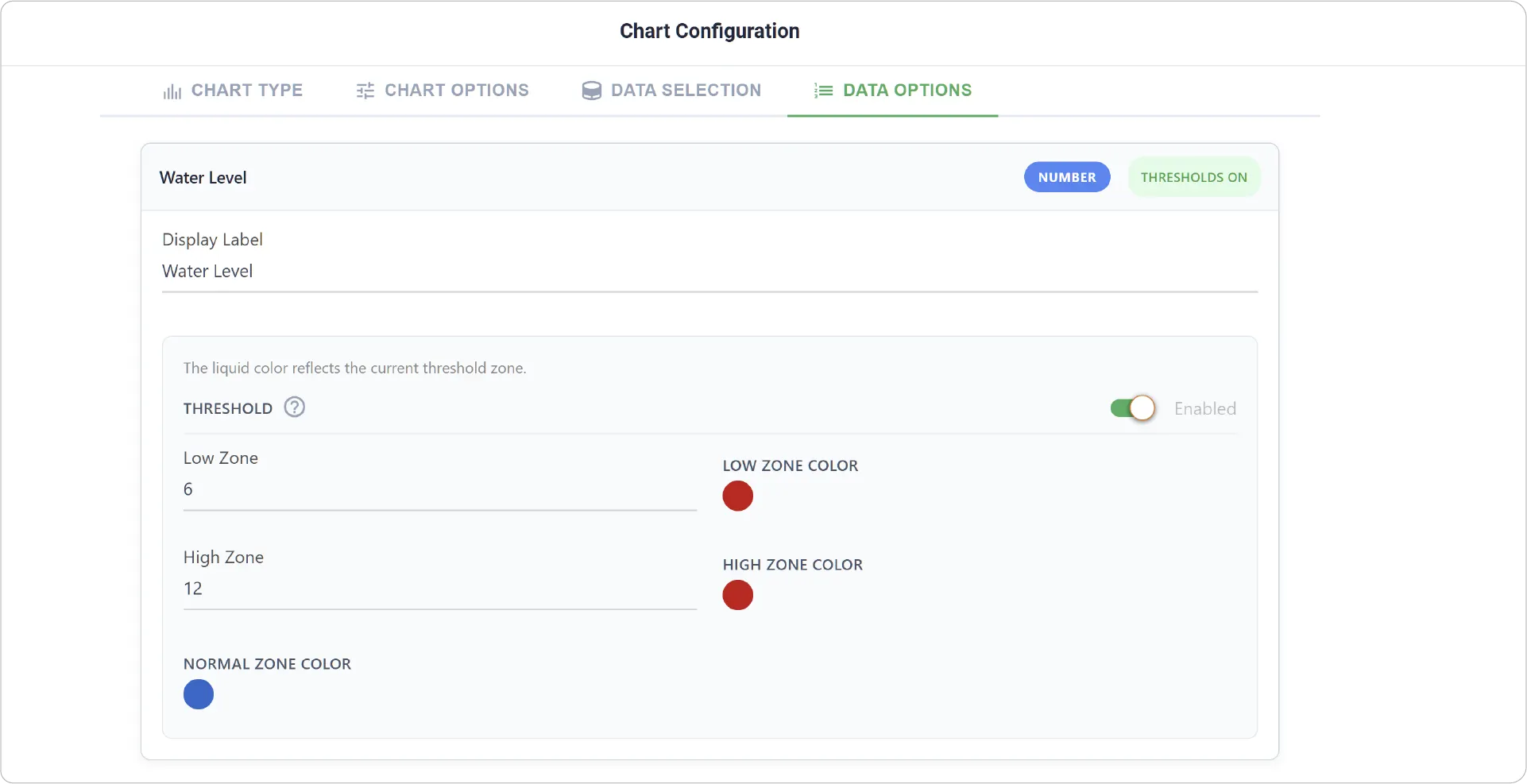
- Data Options: Customize Display Label and Threshold settings for the selected metric.
- Data Options are not available when Create Group is enabled.
Real-World Examples:
-
Tank And Reservoir Monitoring
Visualize water, fuel, or chemical storage levels in industrial and facility environments.
-
Energy And Utility Systems
Monitor battery charge levels, power utilization, or UPS capacity in real time.
-
Manufacturing And Process Control
Track production line fill levels and machine operating capacity.
Get Creative!
The Level Chart is surprisingly versatile and effective visualization tool for monitoring levels-driven metrics. Consider how its dynamic visual format can bring clarity to your unique data representation needs.
Ready to explore more visualization options? Check out other dashboard charts and widgets to build powerful real-time monitoring experiences!
Need help? Contact our support team: support@machinechat.io