Unlock Insights with Powerful Data Visualization Charts
Grid Dashboard's data visualization transforms raw metrics into meaningful insights by presenting information through intuitive and interactive charts. Explore a wide range of single-metric and multi-metric chart types designed to help you monitor, compare, and analyze IoT data effectively.
Single-Metric Charts
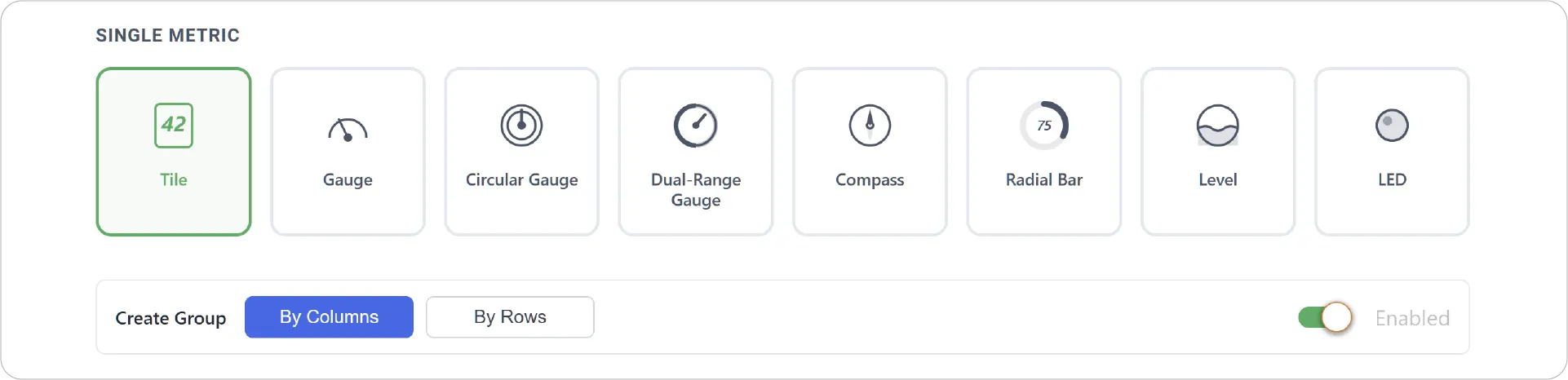
Single-metric charts are designed to highlight one key value at a time, making them ideal for status monitoring and quick insights.

- Tile Chart: Displays a single value in a clean, minimal format for quick status checks.
- Gauge Chart: Shows a value within a defined range using a dial-style visualization.
- Circular Gauge Chart: Represents values on a full 360° circular scale for intuitive range tracking.
- Dual-Range Gauge Chart: Visualizes a metric across two distinct operating ranges for enhanced context.
- Compass Chart: Displays directional or heading-based data on a compass dial.
- Radial Bar Chart: Represents progress or utilization as a circular filled arc for quick interpretation.
- Level Chart: Displays a metric using an animated liquid fill effect to visually represent capacity or utilization levels.
- LED Chart: Uses animated LED-style indicators to display boolean states such as on/off or active/inactive.
Create Group
Single-metric charts also support the Create Group feature, allowing you to group multiple charts together by row or column for easier comparison and centralized monitoring.
Multi-Metric Charts
Multi-metric charts allow you to compare multiple data points, uncover trends, and analyze relationships between metrics.

- Time Series Chart: Plots multiple metrics over time to analyze trends and correlations.
- XY Chart: Visualizes relationships between two or more metrics to identify dependencies.
- Bar Chart: Compares multiple metrics side by side for easy value comparison.
- Area Chart: Shows trends and magnitude with filled areas to highlight contribution over time.
- Table Chart: Presents structured, precise multi-metric data in rows and columns.
- Pie Chart: Displays proportional distribution of metrics within a whole.
- Donut Chart: Similar to pie chart but with a central space for improved readability and focus.
- Events Chart: Visualizes event-based or boolean metrics to track state changes over time.
See the Power in Action
Build dashboards that go beyond simple data display and deliver meaningful insights at every level. Whether you're tracking a single critical metric or analyzing complex multi-metric relationships, these visualizations help you understand your data faster, clearer, and more effectively.
Begin your visualization journey today!
For more ways to visualize and interact with your data, check out JEDI's Table Dashboard and Web App Dashboard.
Need help?
Contact our support team: support@machinechat.io