JEDI's Table Chart
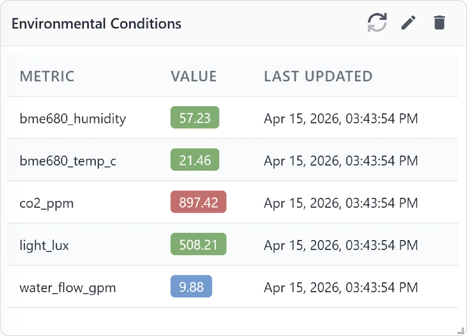
Table Chart displays multiple metrics in a structured, column-based layout, allowing you to compare values within a single view. This chart is ideal for scenarios where precise values, detailed comparisons, and efficient data scanning are more important than graphical visualization.
Key Features
-
Structured Data Layout
Organize data into rows and columns for a clear and consistent structure for easy reading.
-
Efficient Data Analysis
Quickly scan and compare multiple metrics across the same time range.
-
Multi-Metric Comparison
View multiple metrics within a single, unified layout.
-
Sortable Columns
Easily sort data by device or value for faster analysis.
Configuration
Table Chart for Grid Dashboard
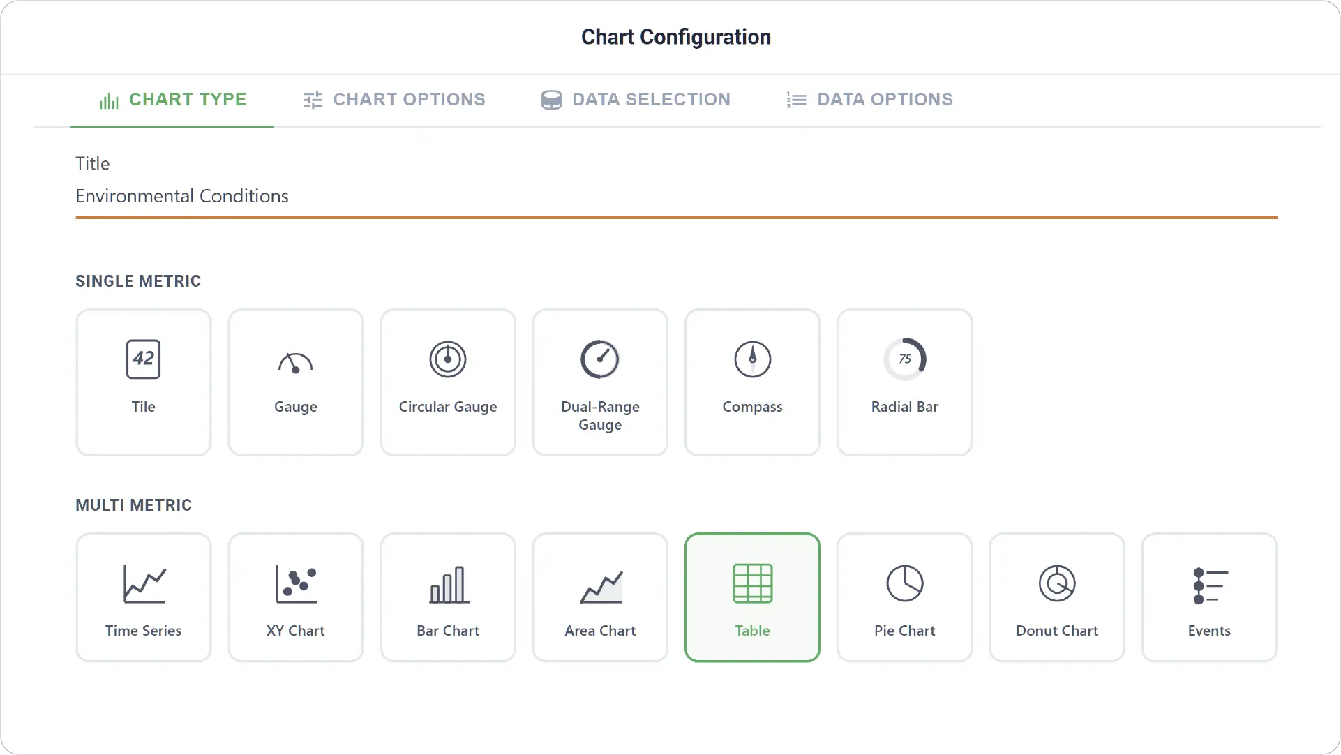
- Chart Type: Select the Table Chart type and provide a title for your chart.
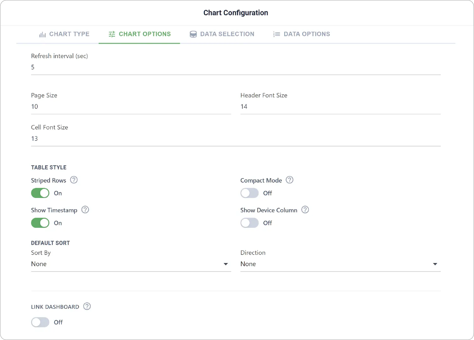
- Chart Options: Configure table behavior and appearance, including:page size, font size, table style, and default sort.
- Enable Link Dashboard to link this chart to another dashboard.
-
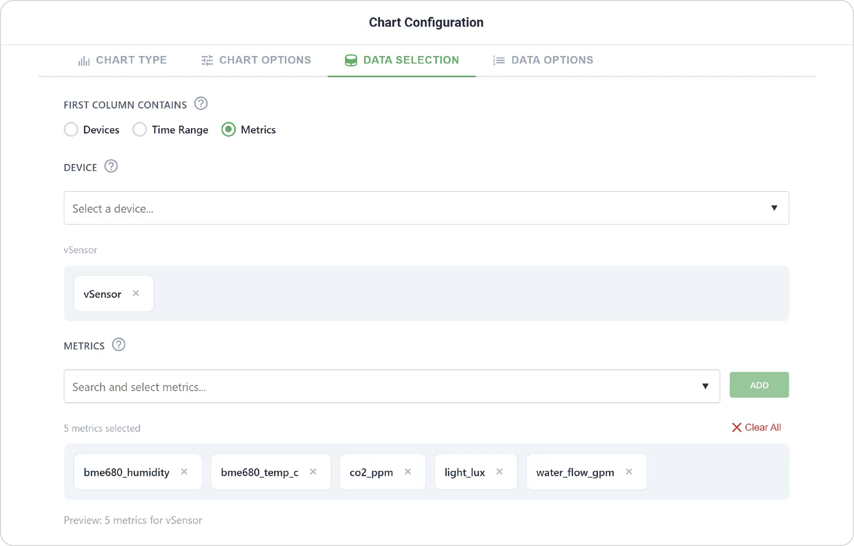
Data Selection: Define how data is structured in the table:
- Choose what the first column represents: device, time range, or metric
- Select the device and relevant metrics
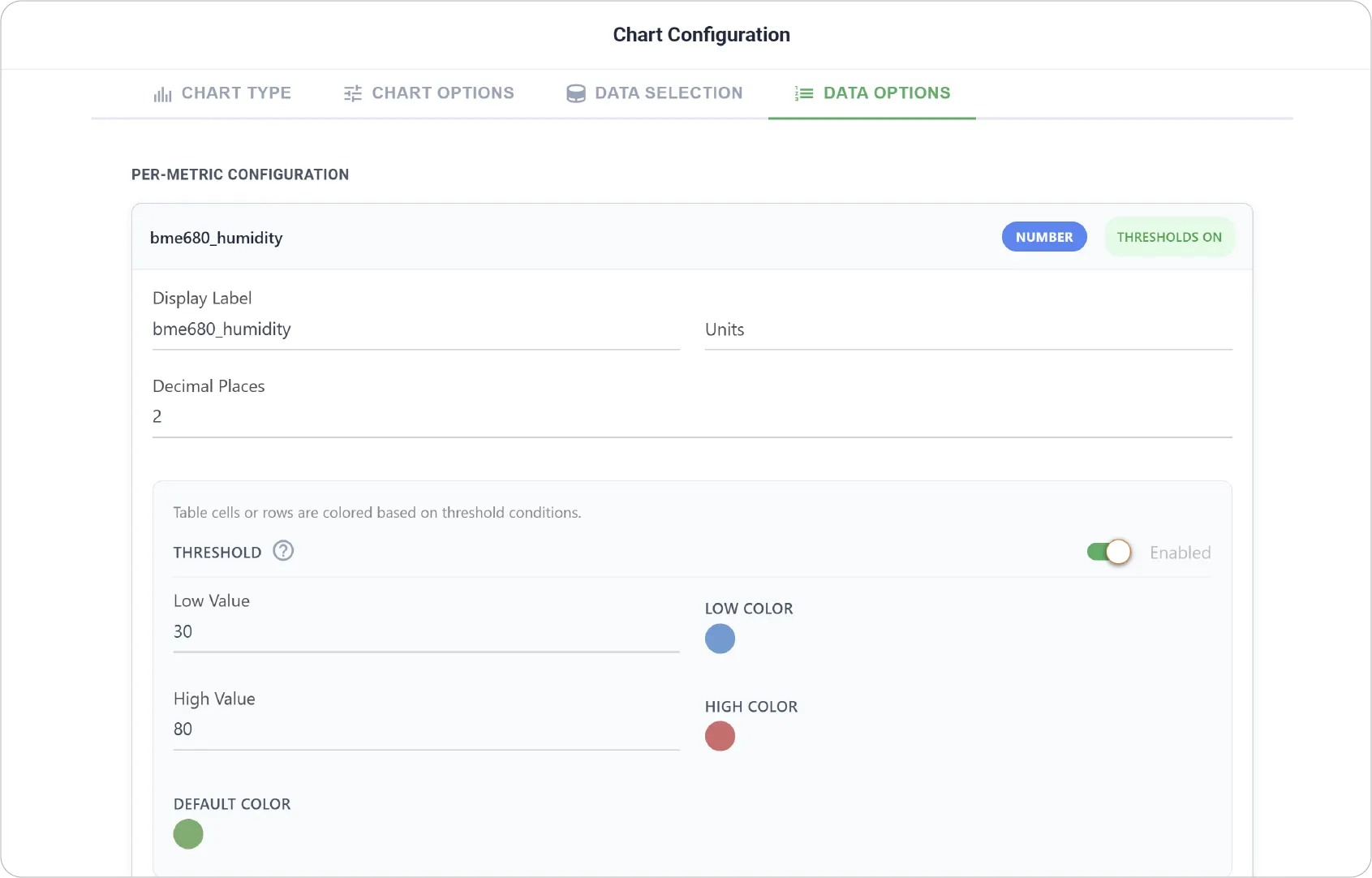
- Data Options: Customize how each metric is presented with display labels for individual metrics and threshold settings with colored low and high zones.
Real-World Examples
-
System Utilization Monitoring
Track metrics like CPU usage, memory, and network activity together for detailed system insights.
-
Comparative Sensor Analysis
Compare readings from different sensors (e.g., temperature, humidity, pressure) at the same timestamps.
-
Operational Data Review
Analyze multiple performance indicators simultaneously to identify trends or anomalies.
Unlock detailed insights with the Table Chart for precise comparisons and efficient analysis. Explore other chart types to create a more dynamic and comprehensive dashboard experience.
Need help? Contact our support team: support@machinechat.io