Visualize Percentages with JEDI's Radial Bar Chart
A Radial Bar Chart is a circular visualization that represents a single metric as a filled arc, showing progress or utilization within a defined range. Unlike traditional gauges, Radial Bar charts emphasize proportional fill and are especially effective for showcasing completion levels in a compact, modern format.
Key Features
-
Arc-Based Visualization
Displays values as a filled circular segment for intuitive progress tracking
-
Intuitive Percentage Representation
Naturally conveys progress, utilization, or completion levels
-
Threshold-Aware Coloring
Highlights different performance zones using configurable ranges
-
Space-Efficient Design
Delivers strong visual impact even in compact dashboard layouts
Configuration
Radial Bar Chart for Grid Dashboard
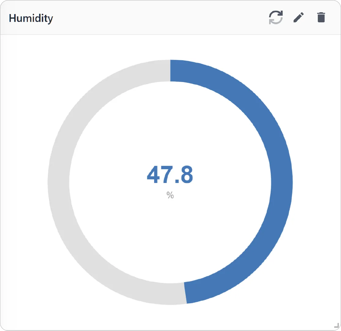
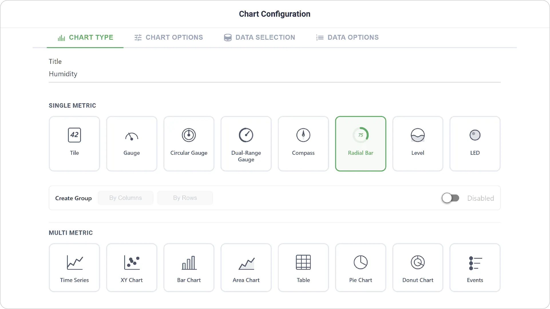
- Chart Type: Select the Radial Bar Chart type and add a title for the visualization.
- Enabling Create Group allows you to add more than one Radial Bar.
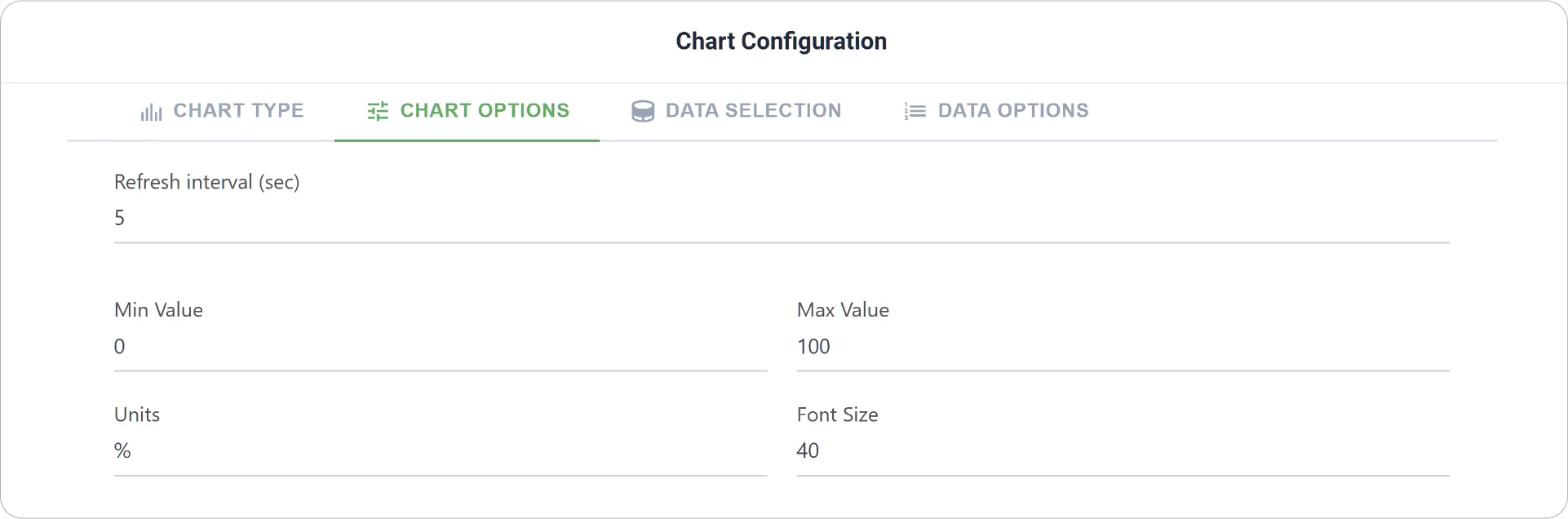
- Chart Options: Customize visual presentation by adjusting font styles, metric units, and defining the minimum and maximum scale values for the radial range.
- Create Group Settings: Available when Create Group is enabled. Set Label Font Size for each grouped Radial Chart.
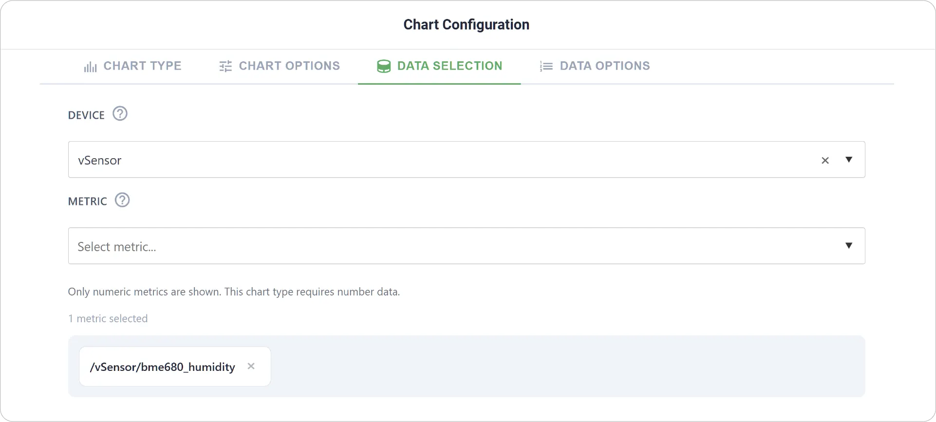
- Data Selection: Choose the target device and select the single metric that will drive the radial visualization.
- Add Item: Available when grouping is enabled, allowing addition of multiple Radial Charts along with Min-Max Values, Units, Fill Color, and Threshold settings for each Metric.
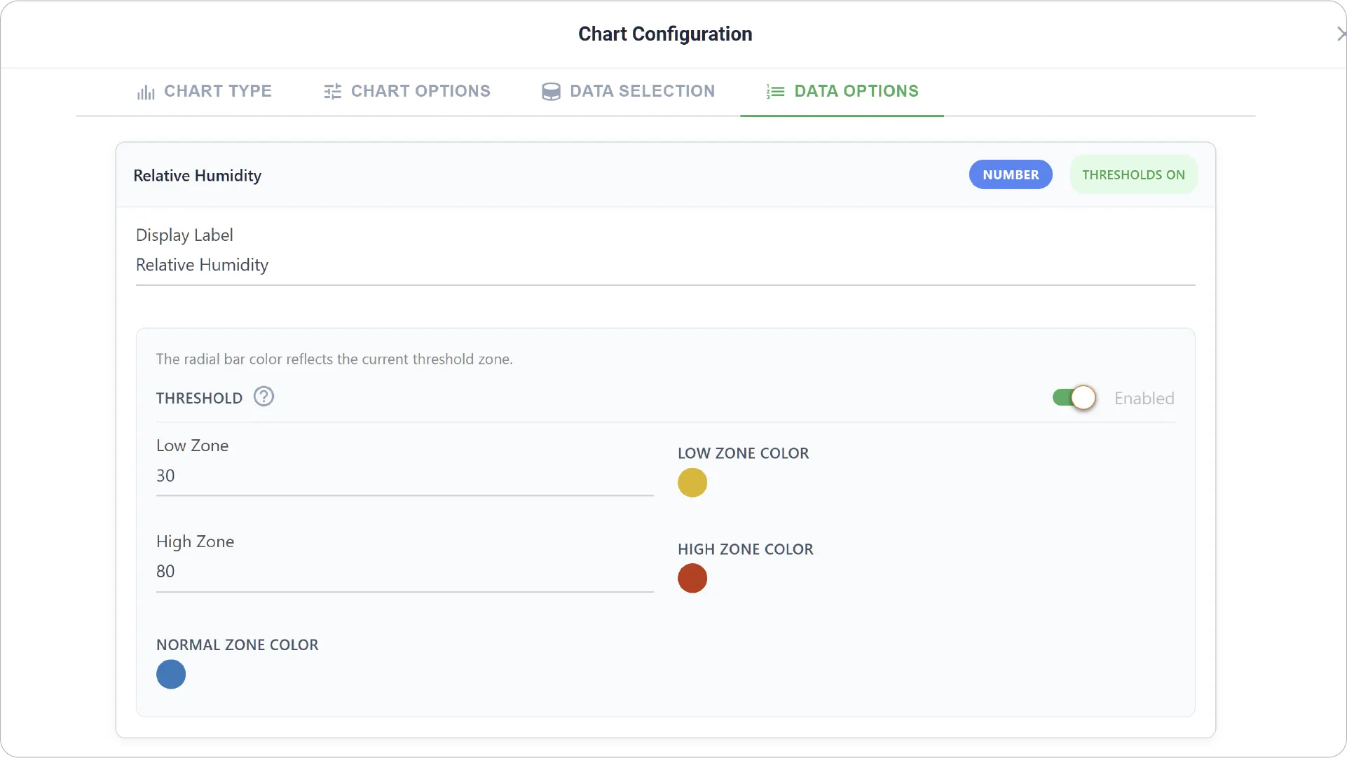
- Data Options: Configure how the value is interpreted and displayed, including label formatting and threshold zones that define low and high performance ranges with distinct colors.
- Data Options are not available when Create Group is enabled.
Real-World Examples
-
System Utilization Monitoring
Display CPU, memory, or storage usage as a percentage of total capacity.
-
Production or Task Completion Tracking
Visualize progress toward completion goals in manufacturing or workflow systems.
-
Energy or Resource Consumption Tracking
Monitor how much of a resource quota (like bandwidth or power usage) has been consumed.
Elevate your data visualization with the Radial Bar Chart! Explore our other Data Dashboard chart guides to unlock even more possibilities.
Need help? Contact our support team: support@machinechat.io